Zenitas Healthcare
Client Zenitas Healthcare
Zenitas is one of Australia’s fastest-growing healthcare groups, bringing together a diverse portfolio of leading brands including Australian Homecare, Dimple, Lifecare, Modern Medical, Accommodation & Care Solutions, Ontrac and Beleura. As a parent company with a broad national footprint, Zenitas plays a vital role in supporting and connecting healthcare providers across the country — united by one purpose: to deliver better care, together.
Operating in a fast-paced and constantly evolving sector, Zenitas recognised the need to strengthen its brand identity and ensure consistency across its network. The goal was to maintain a highly regarded reputation among stakeholders, partners, and the broader community while communicating a refreshed Customer Value Proposition (CVP) centred on one powerful idea — Connection.
Our brand strategy focused on aligning Zenitas’ visual and verbal language with this new direction. We needed to create a modern, unified branding system that conveyed warmth, collaboration, and trust — while reinforcing Zenitas’ leadership position within the healthcare landscape. The challenge was to balance corporate credibility with human empathy, ensuring the brand resonated equally with medical professionals, partners, and patients alike.
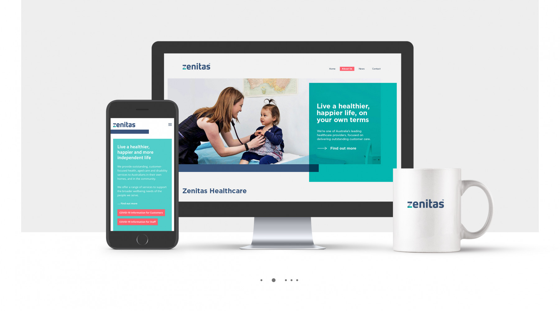
Through refined brand communications and creative direction, we revitalised the look and feel of the brand — simplifying the identity, refreshing the colour palette, and evolving the visual system to better express its promise of connection. The result was a stronger, clearer, and more cohesive brand identity that reflects Zenitas’ commitment to people, care, and collaboration across every level of its organisation.
Brand Strategy
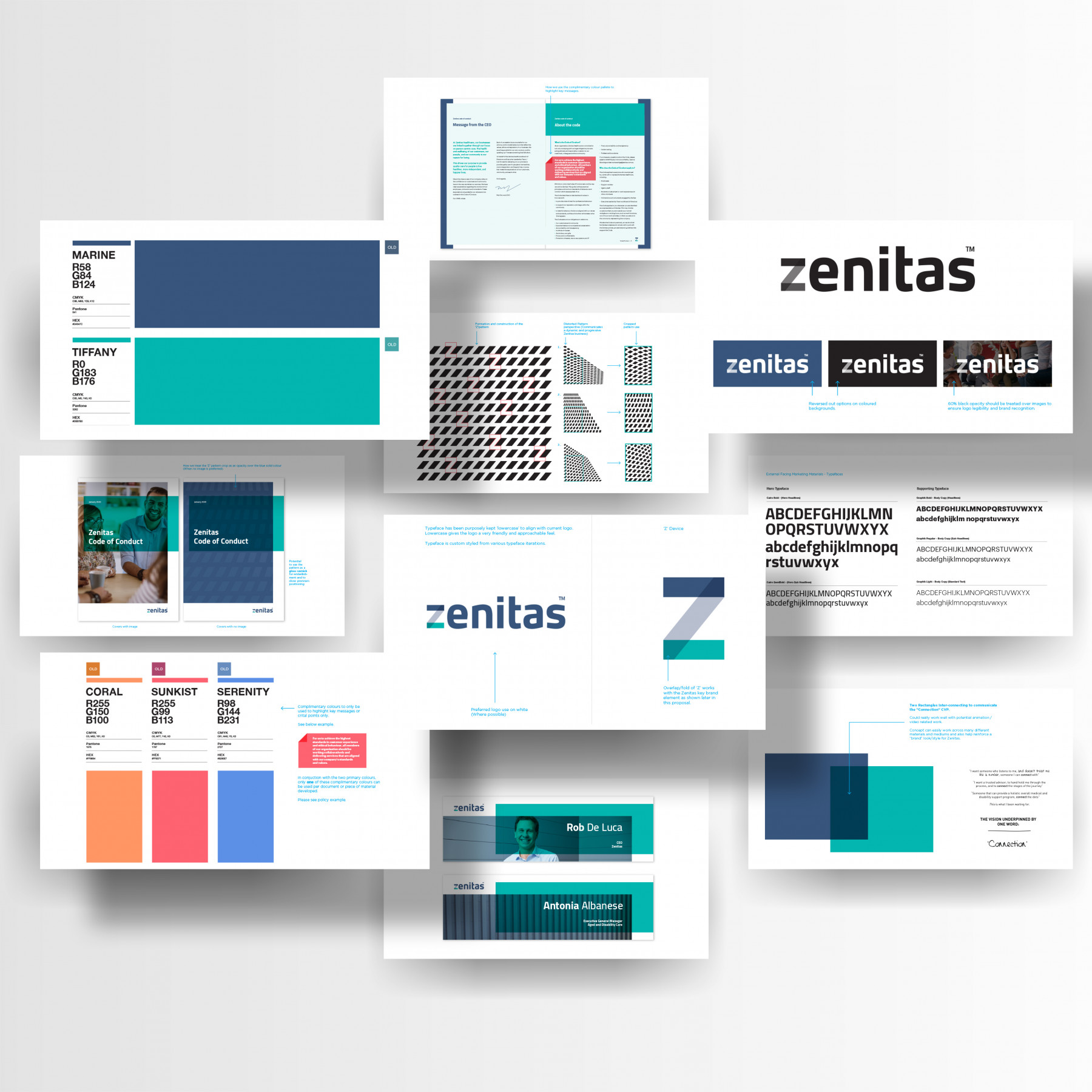
Zenitas is a strong and recognisable brand in the circle of ‘Healthcare’, but like many brands over time ~ Resonance becomes an issue. Brand Identities can get tired and not effectively communicate their positioning or brand story as powerfully as they could through design. So instead of completely overhauling and developing a complete new Brand Identity and framework, we decided to carefully evolve the existing, borrowing the most recognisable brand elements and characteristics of the existing identity and reframing them visually in a more contemporary and meaningful way.
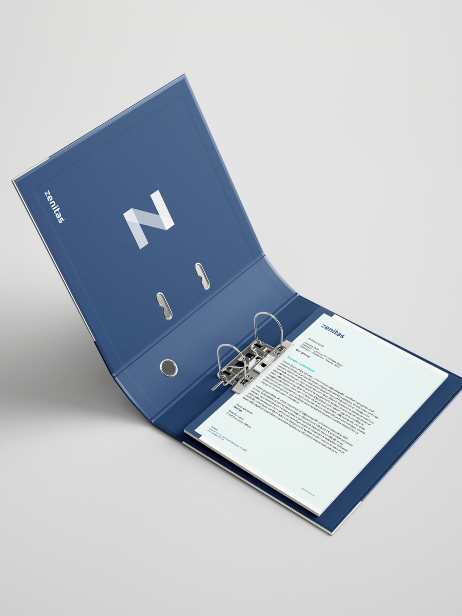
We then further built on the Zenitas brand platform by establishing a key brand device that would become their signature style ~ simply two shapes inter-connecting, coming together and overlapping each other symbolising how Zenitas connects communities together. This inter-related signature elements was an essential brand device to help us communicate the new Zenitas way, bigger vision and new CVP centred around ‘Connection’. This helped form the new Zenitas brand style, look and feel. Brand clarity and consistency was key to the brands transformation.
Creative
In reshaping the Zenitas logotype, we firstly needed to understand the elements and characteristics that made it highly recognisable in its space. When we delved deeper into the old typography of Zenitas, it had a softening and curvature of the letter edges that made it unique, so this was an element that was critical to transfer through to the new design logotype. And this was hand crafted.
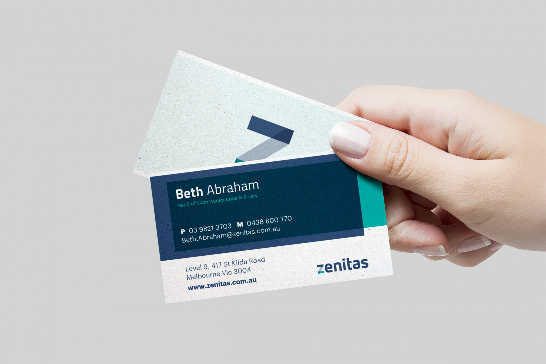
The other unique brand element was the ‘z’ in Zenitas. It was lowercase and was treated differently from a design sense. We felt the same uniqueness needed to be applied to the new design logotype, however the new design also needed to communicate the ‘Connection’ CVP theme. This is where the Zenitas brand device was born. The inter-connected shapes illustrated in the ‘z’ helped communicate the CVP ‘Connection’ theme. It was a proprietary mark that carried the essence of Zenitas brand purely through one letter. This was the power of branding at play.
We then took their key brand device and rolled out a number of key applications and materials where this would play a big part. We developed a refreshing new complementary colour palette for the brand as well as tweaking the primary colours of the brand too. We devised rules in which these colours would apply so everyone was clear on use and application. And we also established a series of brand patterns that was based on the new formation of the ‘z’ logotype. These brand patterns were to be used sparingly and only in situations where imagery was not needed or to give a more corporate tone to the piece.
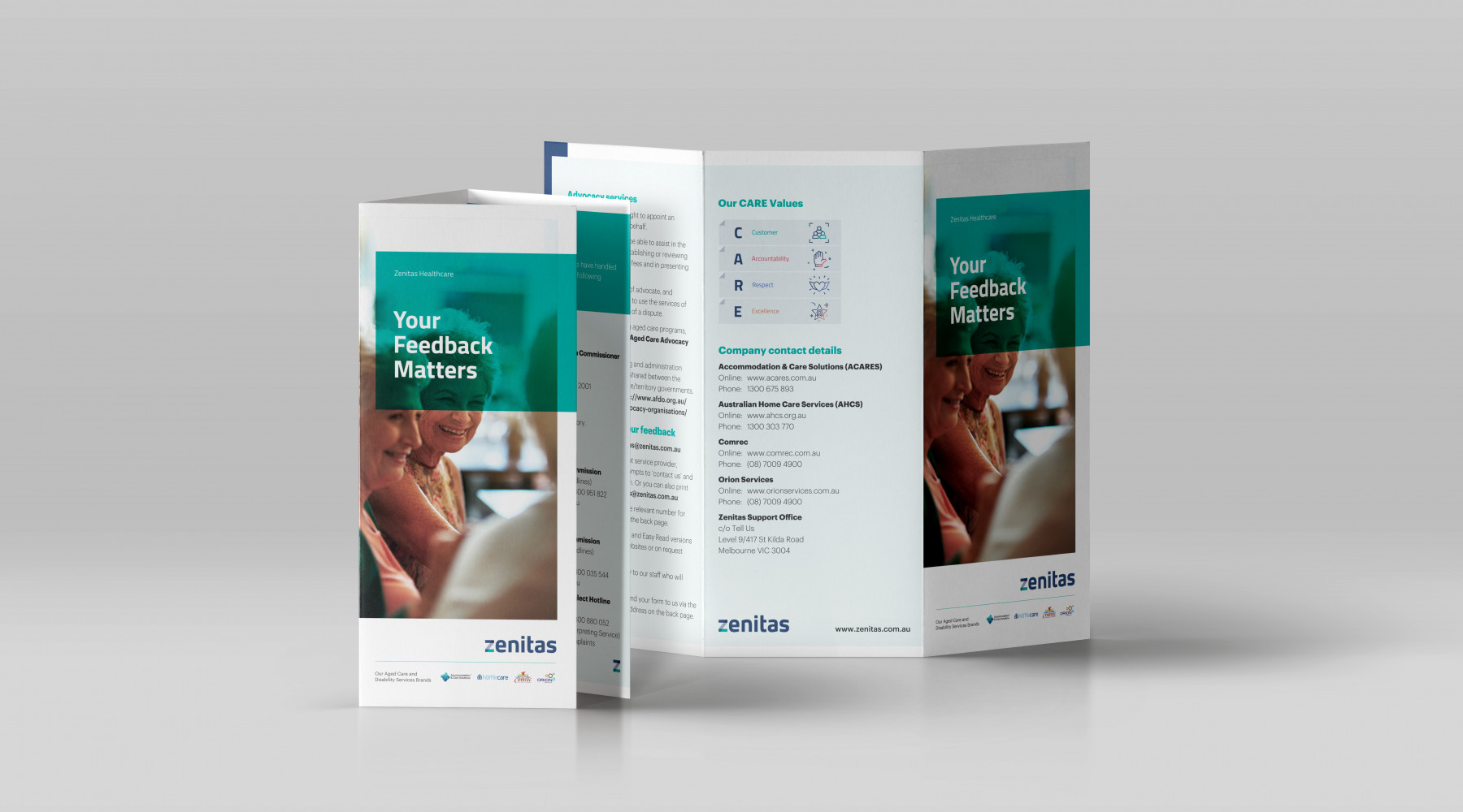
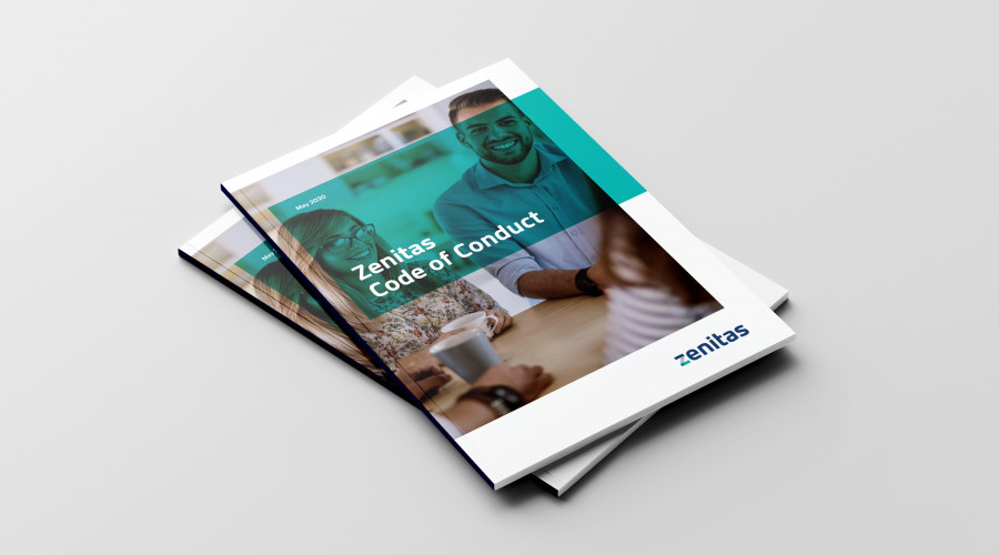
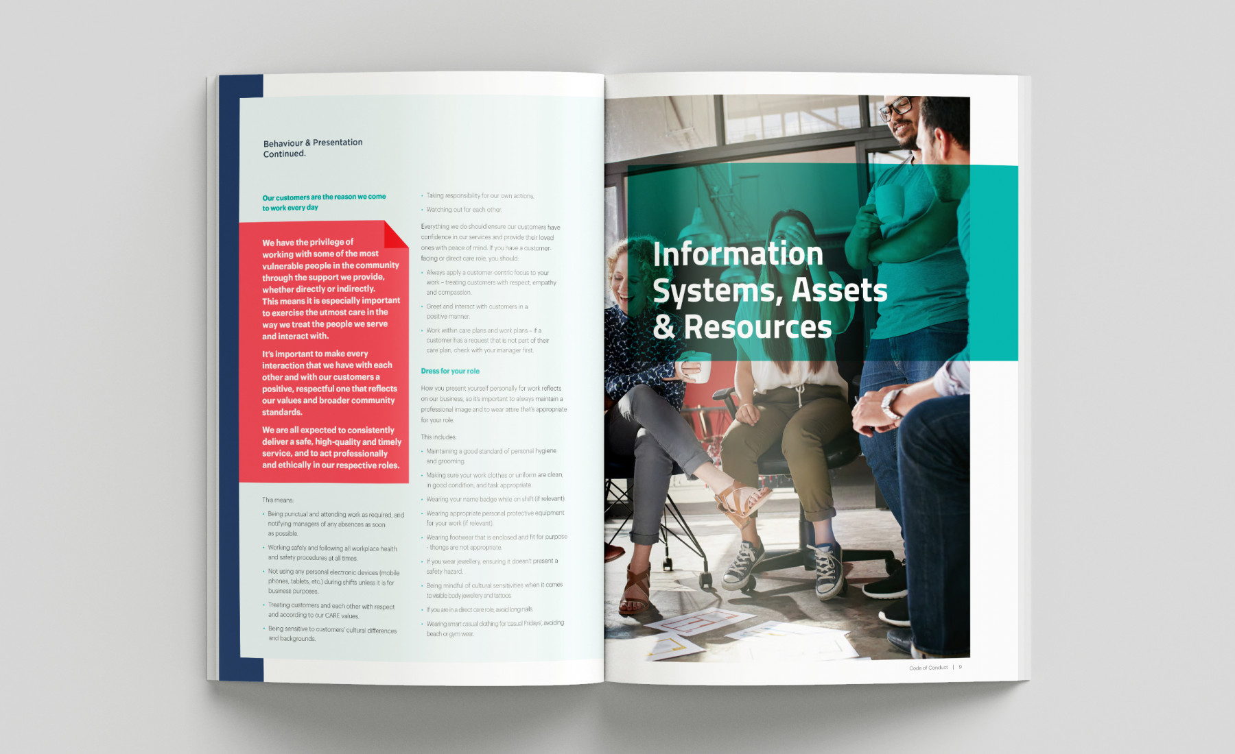
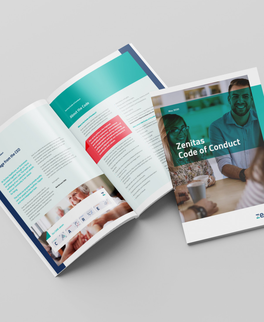
We style guided the entire brand and also carefully curated a collection of brand imagery as part of the Zenitas brand library and segmented each image based on suitability for market segment and type of audience. As part of this library, we also developed 150+ brand icons unique to the Zenitas brand to help people communicate key messages, especially within presentations and internal documents.
Everyone is loving the newly refreshed look of the Zenitas Brand as it takes on a new and exciting path in the healthcare space.
Explore more work