Leisure Concepts | Hyper
Client Leisure Concepts | Hyper
Leisure Concepts is one of Australia’s leading suppliers of commercial gym and fitness equipment, servicing clients across Australia and New Zealand. In a market dominated by global heavyweights such as Precor, Nautilus, Technogym, Cyberfit and Aussie Strength, the challenge was clear: to create distinction in an oversaturated space and build a brand that could flex its own identity.
Our brand strategy set out to do exactly that — to help Leisure Concepts move beyond being a distributor of other people’s products and establish a powerful new brand identity of its own. The vision was to create a fitness brand with real attitude — progressive, unapologetic, and designed for those who don’t follow trends, but set them. A brand that could spark loyalty, ignite passion, and inspire a cult following within the performance training community.
We positioned this new venture as the rebellious sibling of the traditional fitness industry — a brand that challenges the norm and speaks directly to athletes and trainers who live for the grind. Through bold branding, disruptive brand communications, and strong creative direction, the aim was to capture that underground club vibe — something raw, authentic, and unapologetically different.
The result was a distinctive brand positioning that broke free from corporate conventions. A new identity that embodies power, grit, and innovation — giving Leisure Concepts a voice that commands attention in a crowded marketplace and energises a new generation of fitness professionals.
Brand Strategy
Through a series of collaborative brand workshops, market intelligence and gut instinct, we carefully mapped out competitors in the gym space around certain themes/territories. After analysing the environment, we found there to be two distinct themes emerging that gym brands seem to group themselves in; they were ‘The Athlete’ type and the ‘The Artist’ type. Many of these tier 1 competitors owned a large share of voice in their respective territories.
But being the brand HyperFX was to be, we wanted to break the conventional. Challenge the norm and do things a little differently. Through rigorous research and evaluation, we identified a third territory/theme that hadn’t really been tapped in to by other brands, and that was ‘The Rebel’ type. This was the territory we wanted HyperFX to own. It needed to be provocative, anti-establishment, pushing the limits, courageous and totally independent in nature. It was going to be a rare breed of gym equipment that enthusiast wanted to be part of and been seen working out on. So the persona we wanted to evoke in the brand was more around aggression and determination.
Through defining a series of brand pillars, key message development and a narrative, we landed on the key message of ‘Empowering ordinary people to realise their potential’. This was further distilled down into the tagline of ‘Powering Potential’. There were three essential qualities to making this brand great that all communications needed to communicate and they were: Fighter instinct, real people and a visionary attitude. When all these three were used at full force, these essence of the brand was experienced. And this is what the HyperFX brand name was all about.
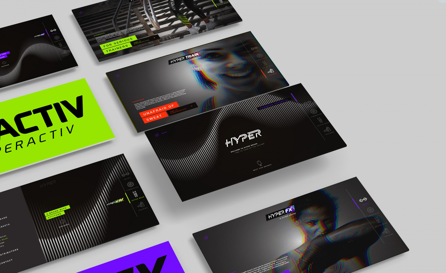
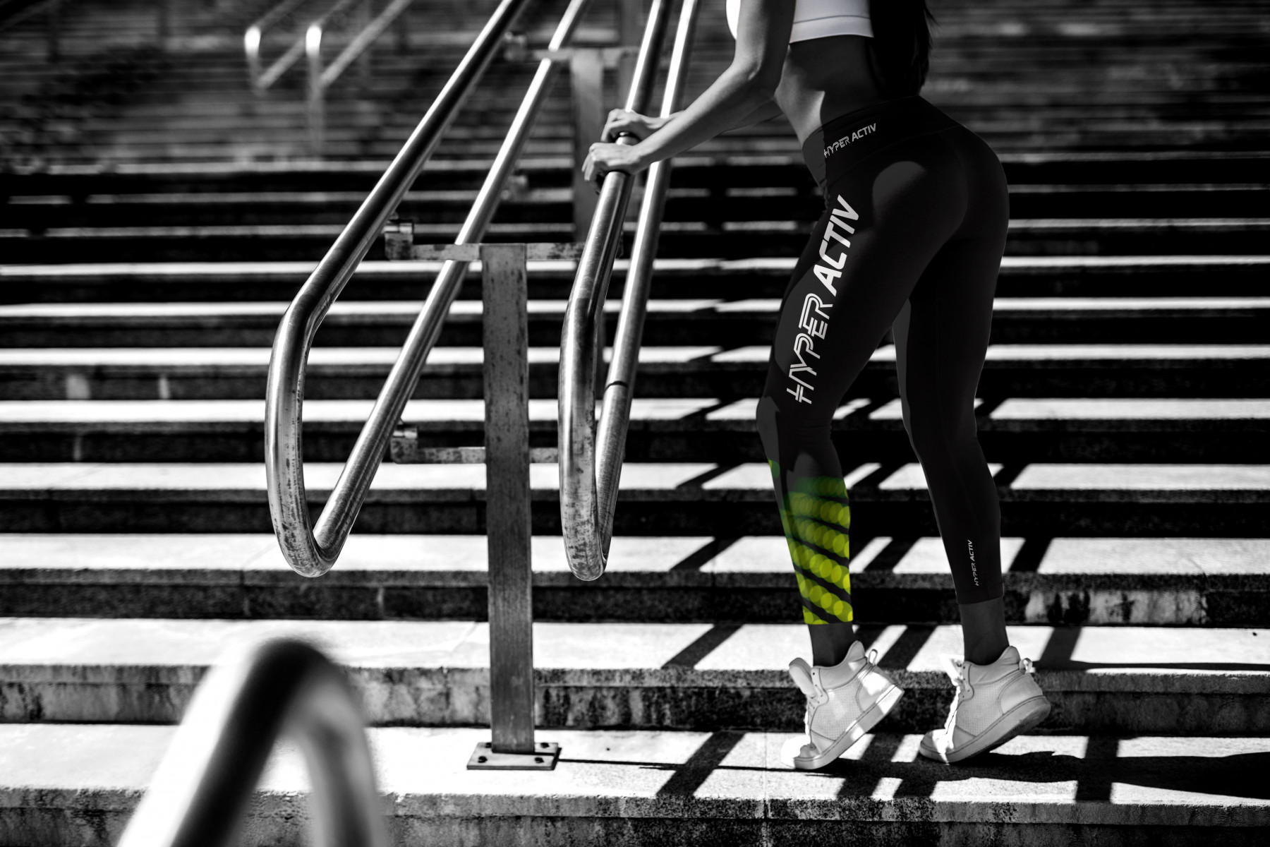
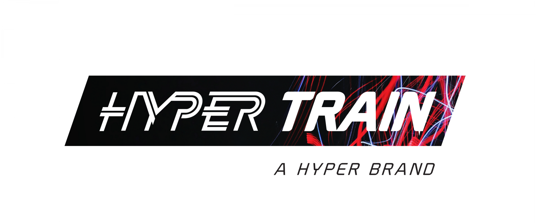
We also architected how the brand naming convention might extend into other categories of fitness spaces like personal training, active wear, education and pilates. It all seemed to fit in just perfectly.
Creative
Because the brands strategy was so well defined and vivid in everyone’s mind, we knew exactly how we wanted to bring HyperFX to life. It was going to be full of energy, have spark, an attitude that expressed dedication and working hard and ultimately a sense of achievement. It was going to be electric.
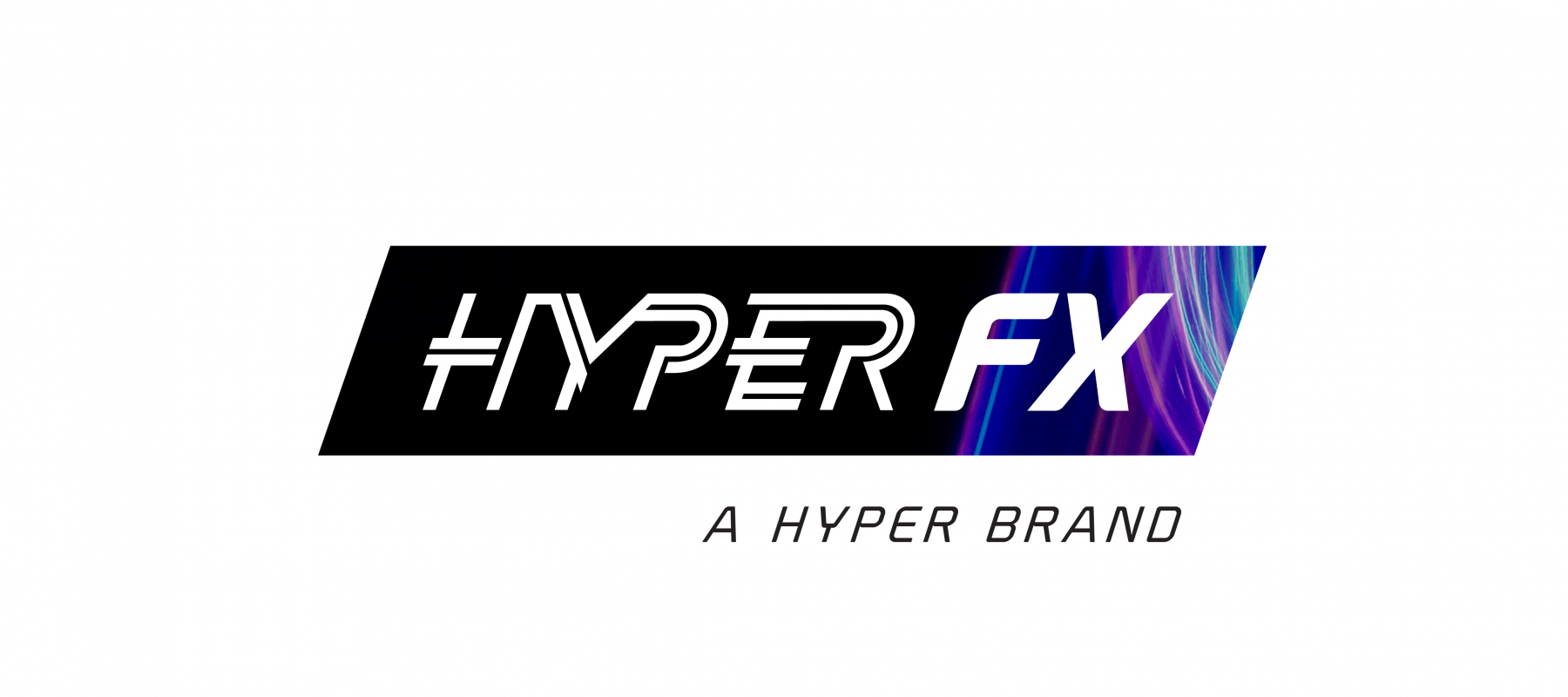
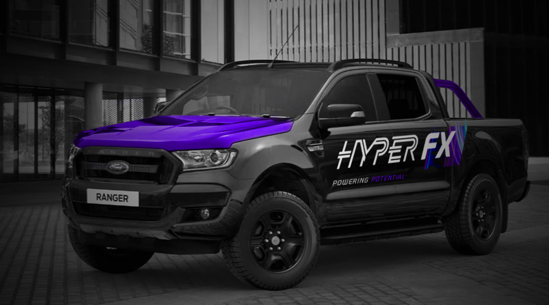
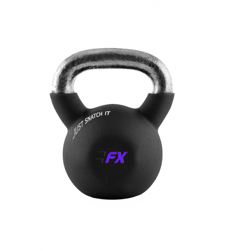
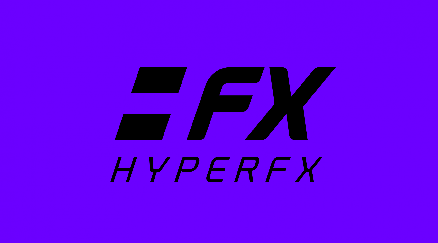
We started carving out a distinctive typestyle for the logo that looked sleek, cutting edge and so refined. Something that we knew the fitness market would respond to well and want to own. We locked this logotype up in an dark angular box to help give it a sense of sleekness, progressiveness and forward thinking attitude ~ qualities that would help give the HyperFX brand the advantage.
But what really bought this Brand Identity truly to life was the fusion of different coloured abstract light graphics we incorporated. It expressed movement, excitement, energy and a love for getting the most out of life. We felt this really captured the essence of the HyperFX brand and the coolness factor.
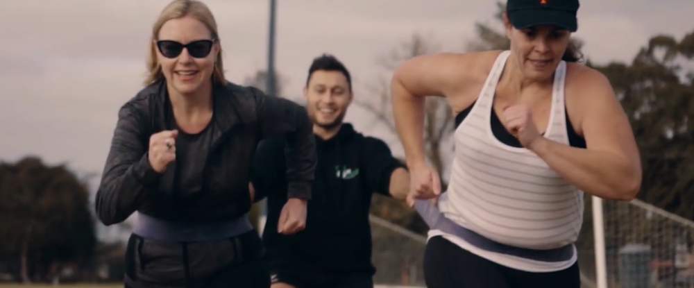
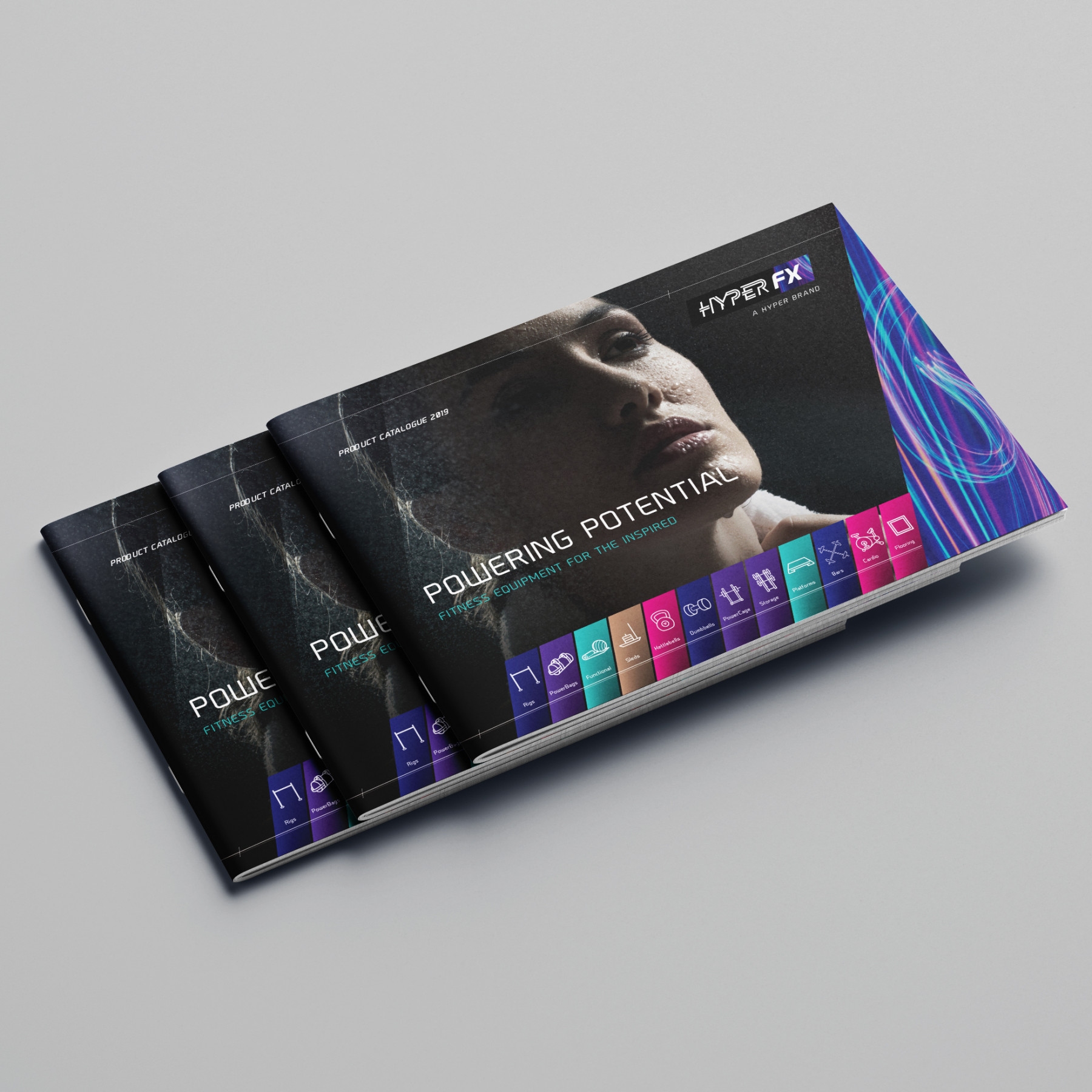
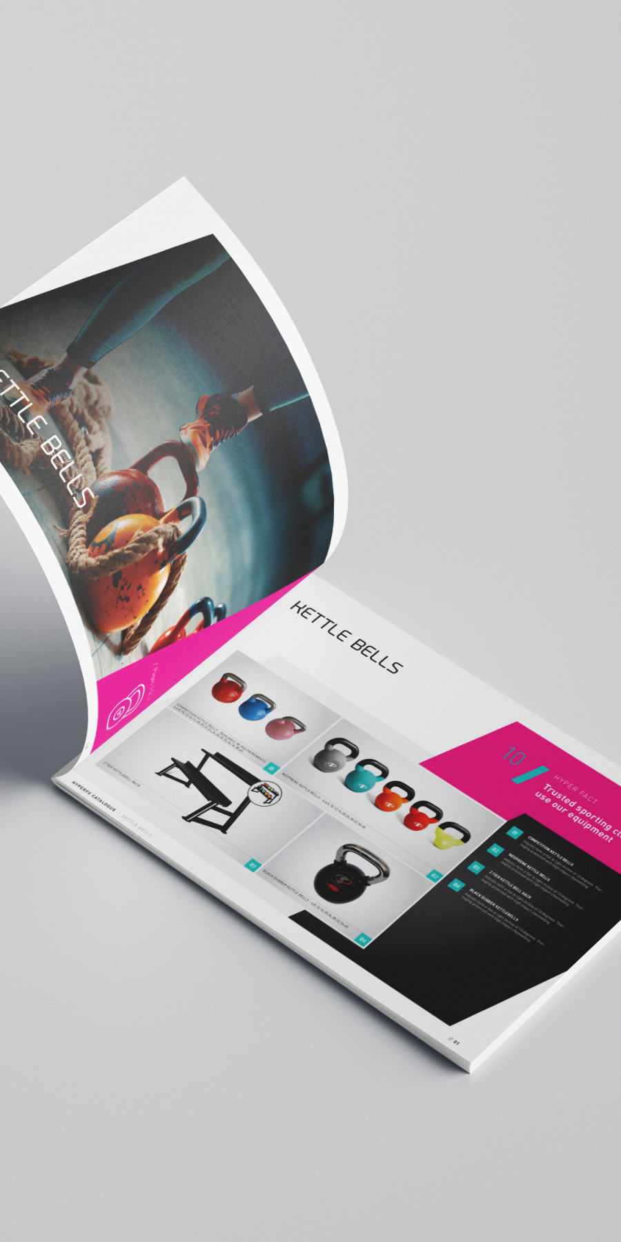
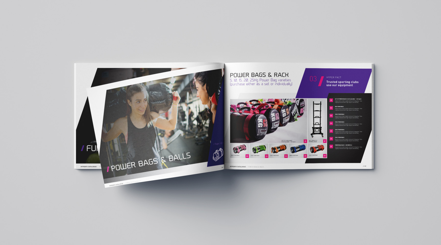
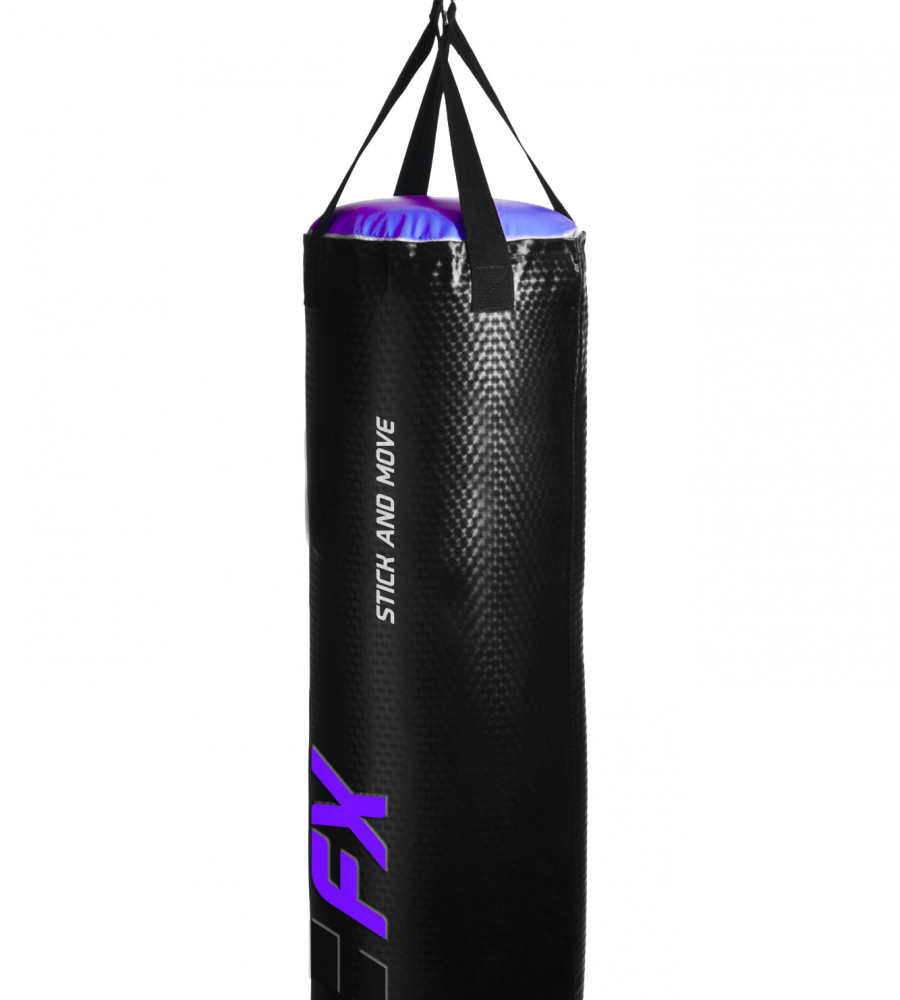
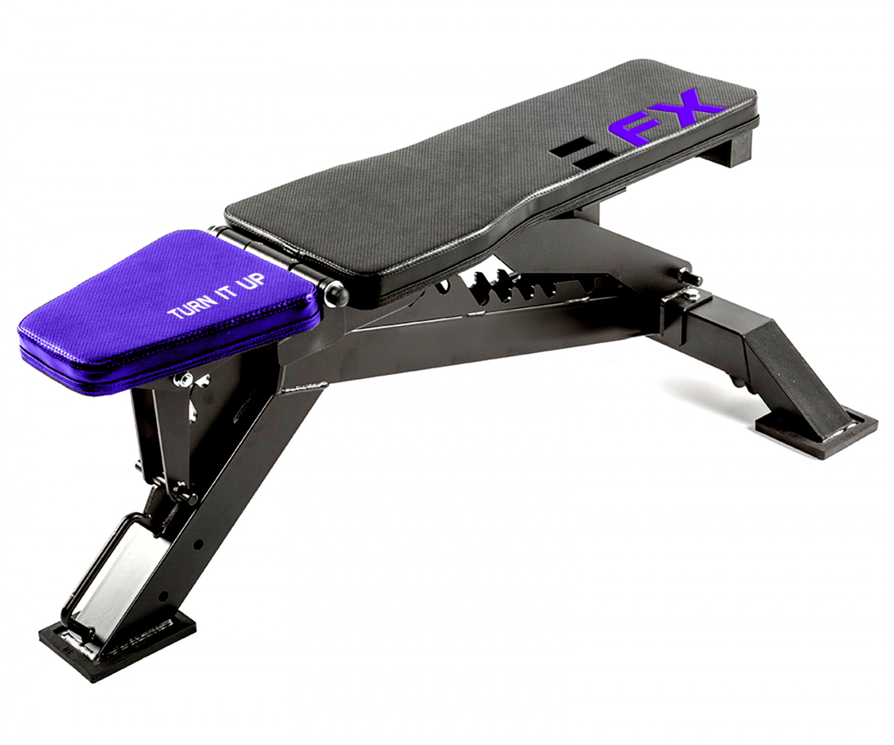
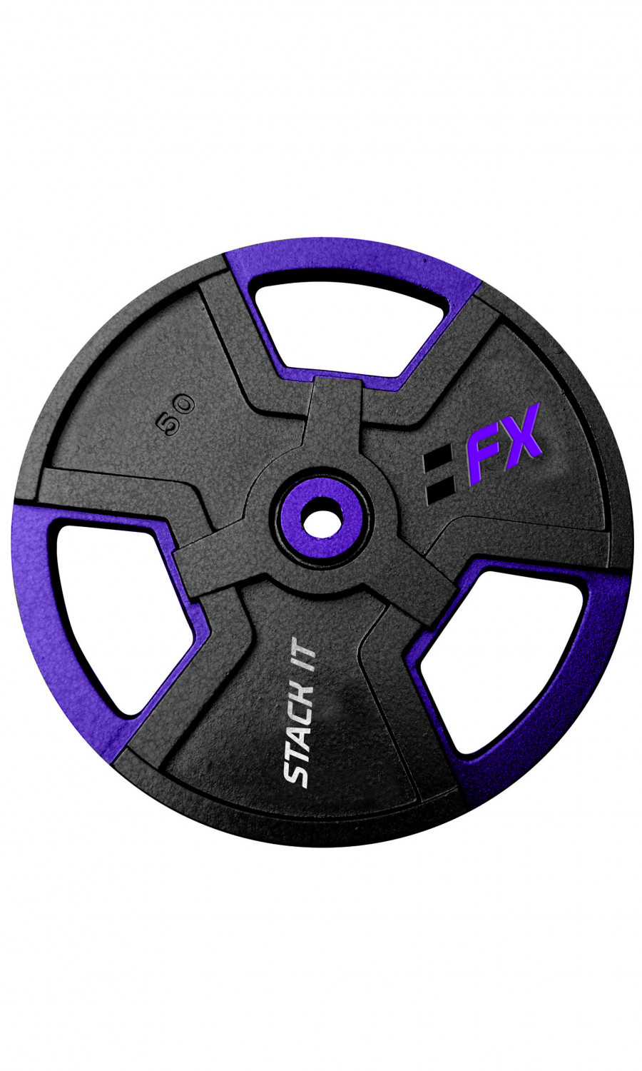
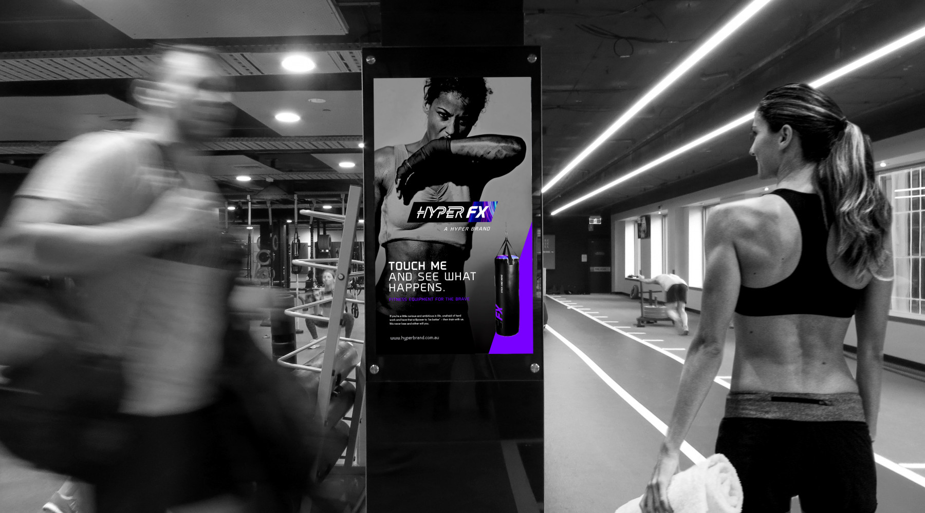
Complimentary to the logotype, we developed a brand imagery style that always captured the sheer sweat, tears and determination of a workout. It needed to look and feel real and convey that ‘no backing down’ attitude that the HyperFX brand was all about. This helped put the brand on another level.
We applied the brand identity to a range of business stationery items, catalogue, car livery, gym equipment, advertising, point-of-sale signage and promotional products. As a family, they really told the story of the new HyperFX brand.
Explore more work