TastyOne
Client TastyOne
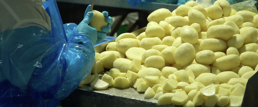
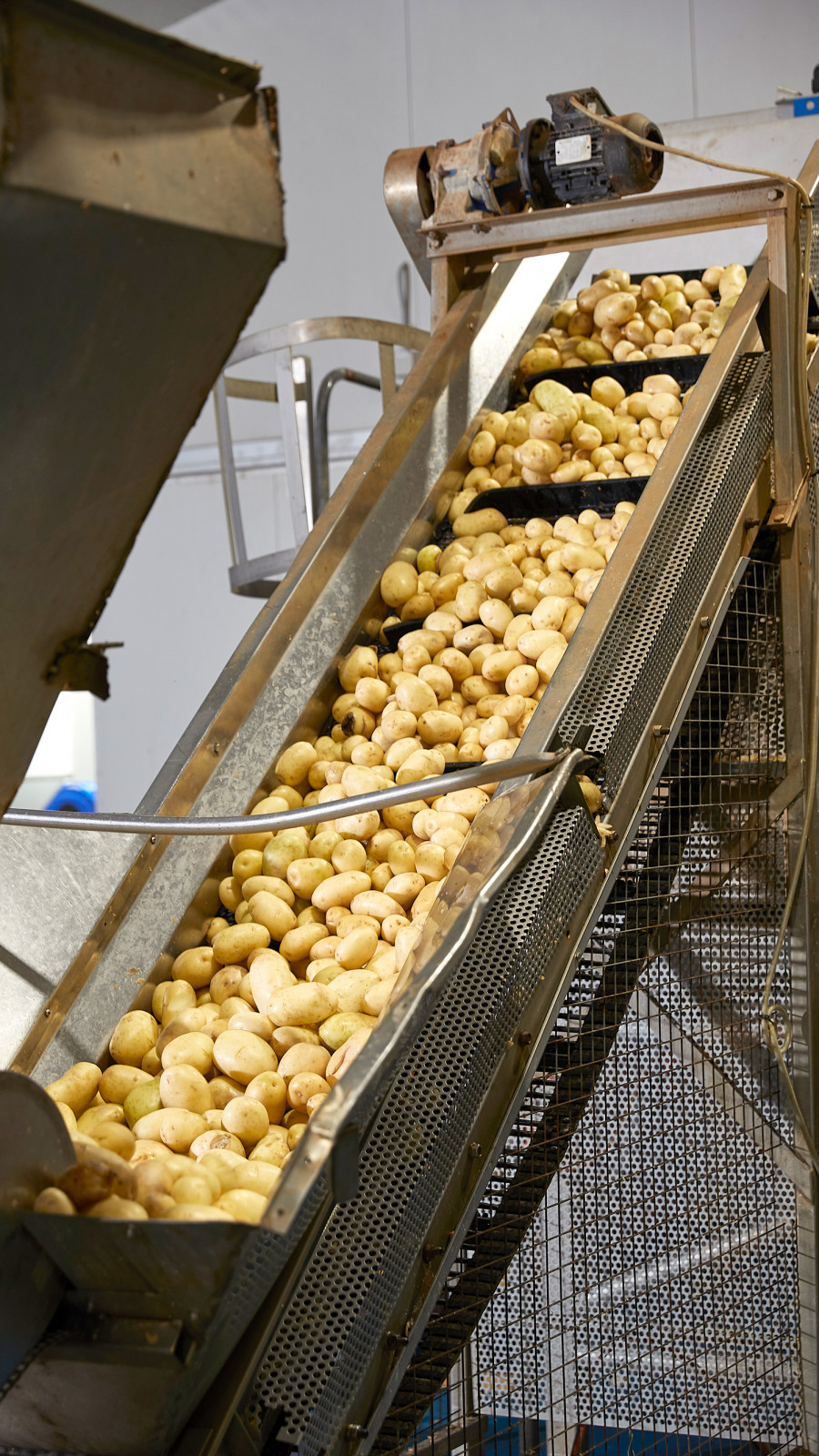
TastyOne, formally (TastyChips) is a fresh produce processing business; a market leader and one of the largest and most reputable suppliers to both large and small businesses in Australia. Now in its 3rd generation.
The business has had huge success over the years (and very much still is), but competition is becoming more and more prevalent. The business needed to make a change quickly ~ a change for the better. And it needed to start at the name. The TastyChips name had built so much creditability over the years with its stakeholders, but it didn’t really communicate what the business offered. Was it fresh potatoes? Fried potato chips? Or both? Here was the exact problem. It was much more.
Perception and first impressions of the brand name opened up a can of worms and it didn’t reflect the brand now or where they wanted the business to go. From supplying providores, retail and convenience clients right through to bulk manufacturers and large hospitality groups; we needed to make a carefully consider name change as well as craft a new brand identity that striked a chord with the old and new. Carving out its own territory again.
Brand Strategy
TastyOne has a rich history and has built a strong rapport with it stakeholders over the years. And because of this, we needed to navigate carefully, especially around the name change. So we began the project interviewing the family directors one-on-one to get a better idea into the business and its future pathways. We also undertook various client facing interviews as well to ensure brand alignment and understand their needs/wants. This provided us with so much qualitative insights that we were able to hit the ground running and confidently explore naming options.
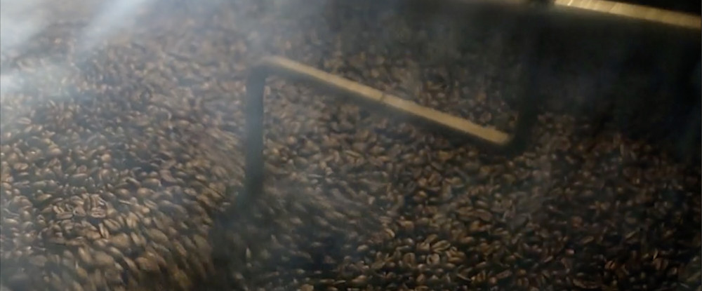
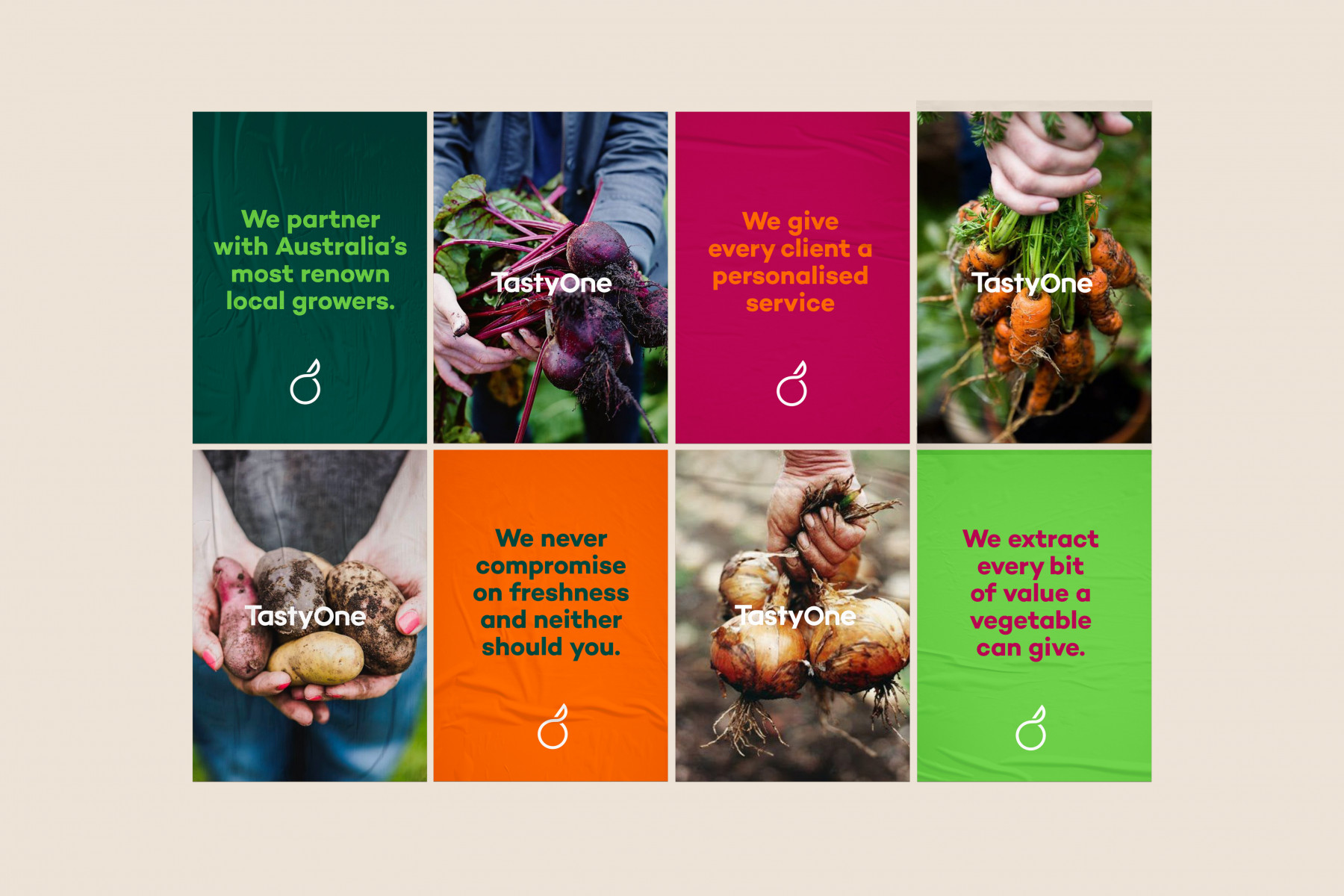
By facilitating various brand and innovation workshops with their team and conducting quantitative research via Survey Monkey, we were able to engage their staff/people and clients and unearth new ideas to better position the brand for future growth. One of the most pivotal insights we unravelled during this strategic engagement process was around ‘innovation’ and using the ‘whole’ of vegetable, skins ‘n’ all ~ using food wastage to create greater opportunities. This is how the idea of ‘One’ was born. And how TastyOne was re-born.
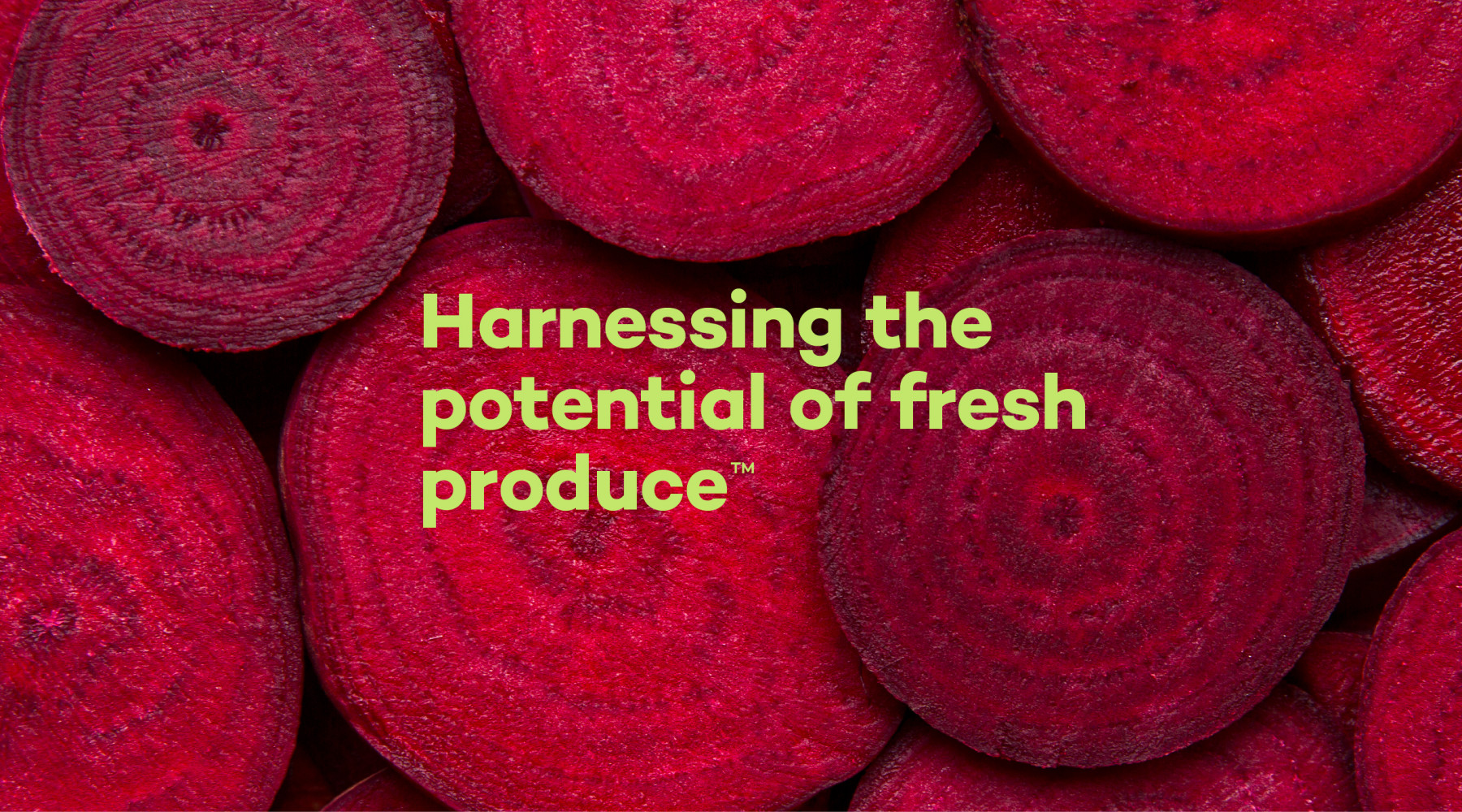
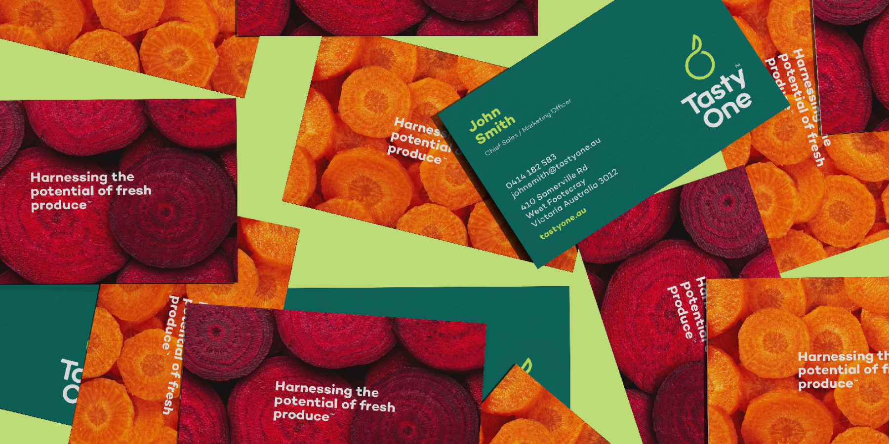
The idea of ‘One’ drove all our thinking to new levels - One Family, One Cycle, One Personalised Service and One Standard. Underpinned by four brand pillars, we developed the key message of ‘Harnessing the potential of fresh produce’, and this became the blueprint for the brand moving forward. It’s lived and breathed internally as a framework and it informs all our communications. We helped re-shape their business and the way they think about their brand and it truly is much more aligned and a better refection of where they are now and where they are driving the business towards. It’s opening up new avenues for growth and at the same time engaging current clientele in new and innovative ways to freshen up their business too. Simply put, TastyOne is a cut above, and rightfully so.
Creative
Developing the TastyOne Brand Identity was highly rewarding after a lengthy consultation process. Having the strategic framework mapped out gave our creative minds plenty of ideas and clarity on design direction and what would represent the business best.
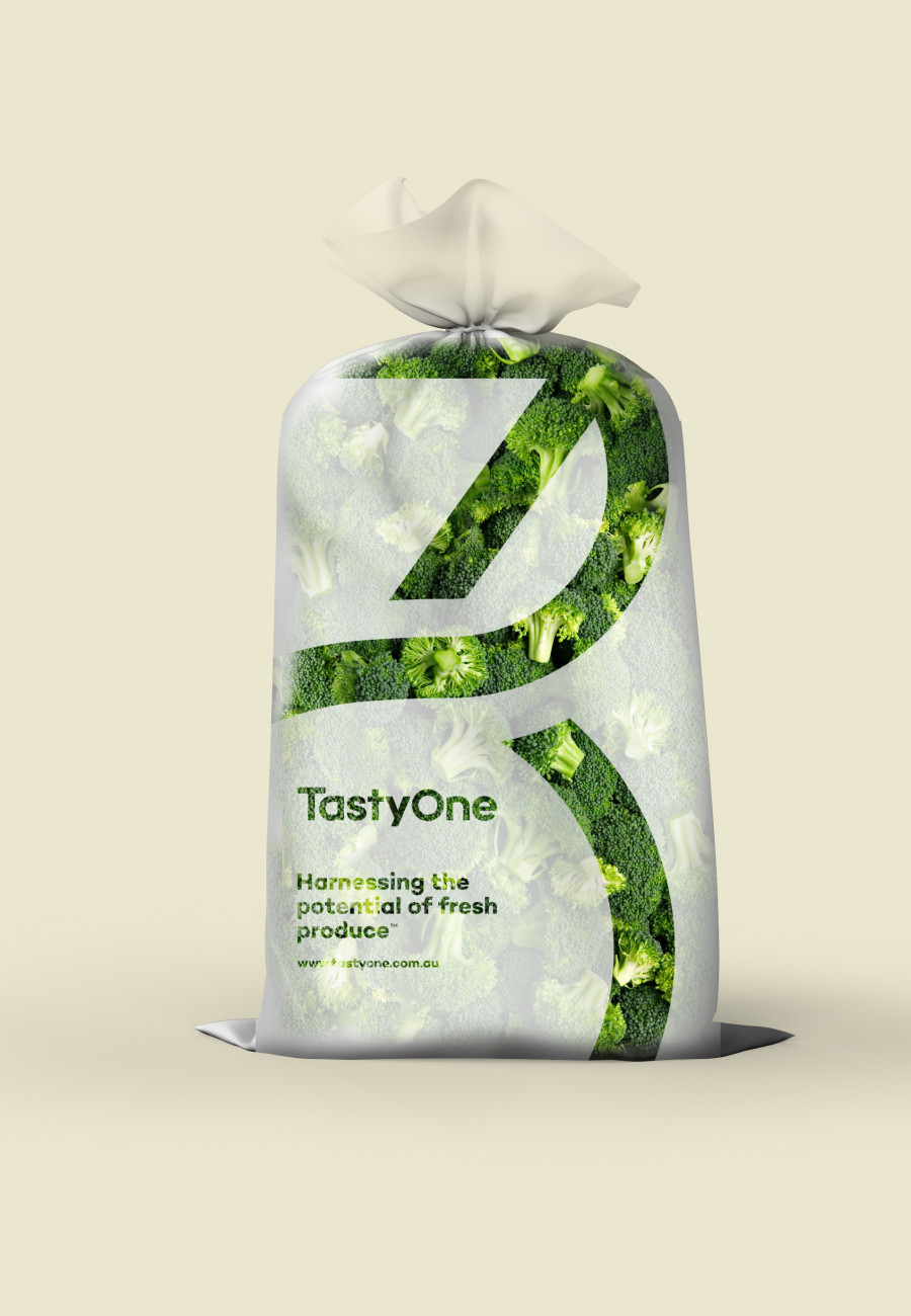
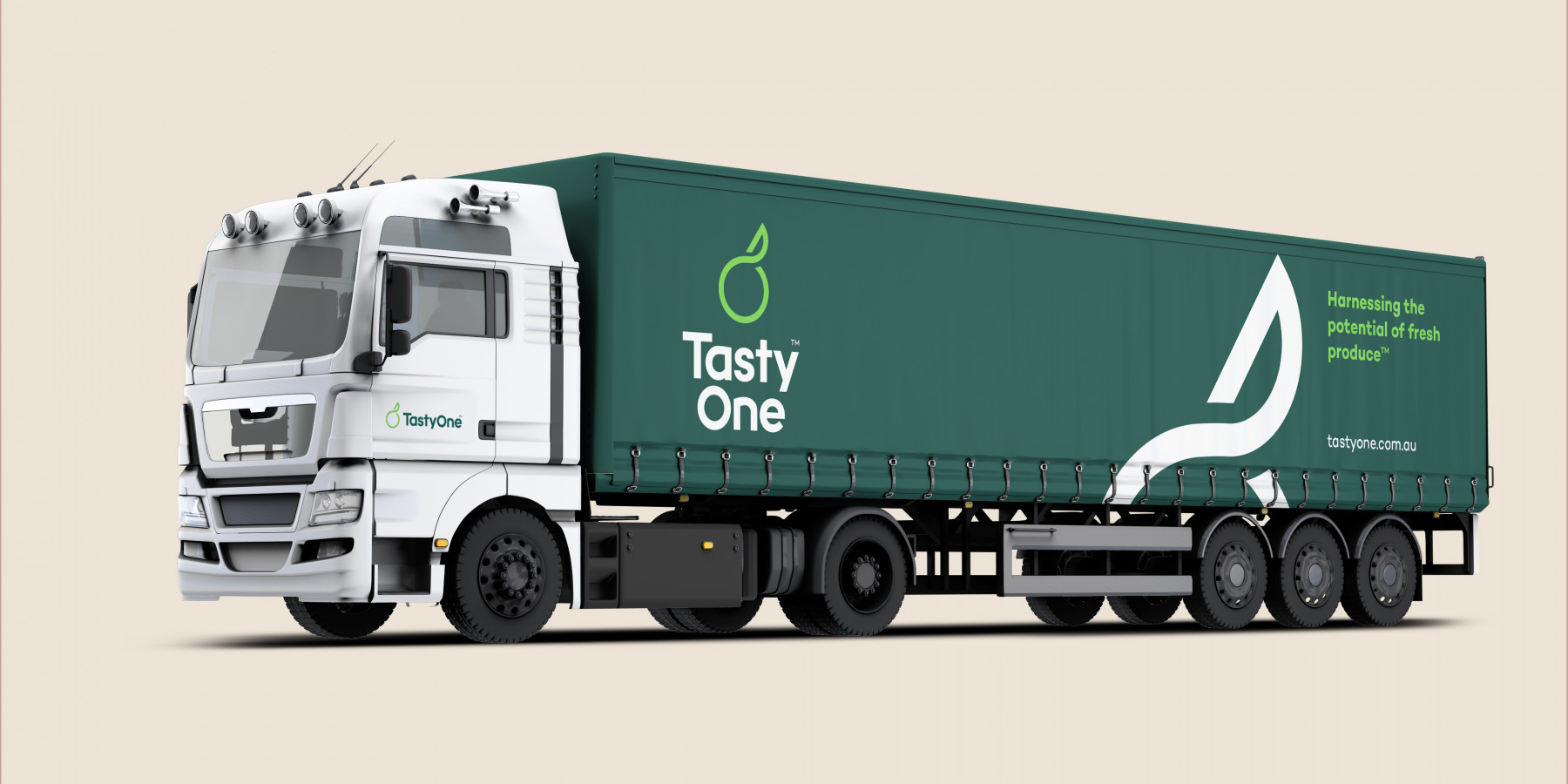
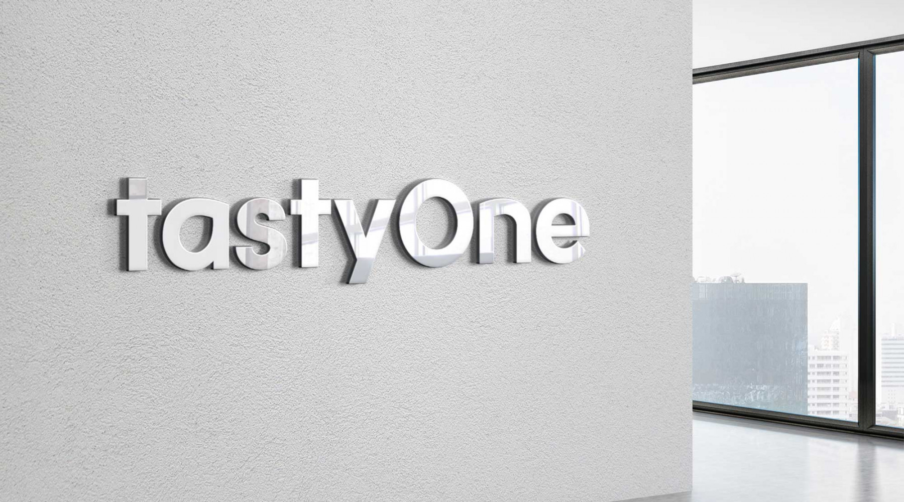
It was clear that the identity needed to communicate the ‘Power of One’ theme in a more cohesive and holistic way. So we started off with a circle and through many iterations later it evolved into a carefully crafted piece of produce with a cut through it communicating the processing and sustainability side of the business. This was complimented by a bespoke approach to crafting the TastyOne typeface, tweaking each letter to work harmoniously with the symbol/logo.
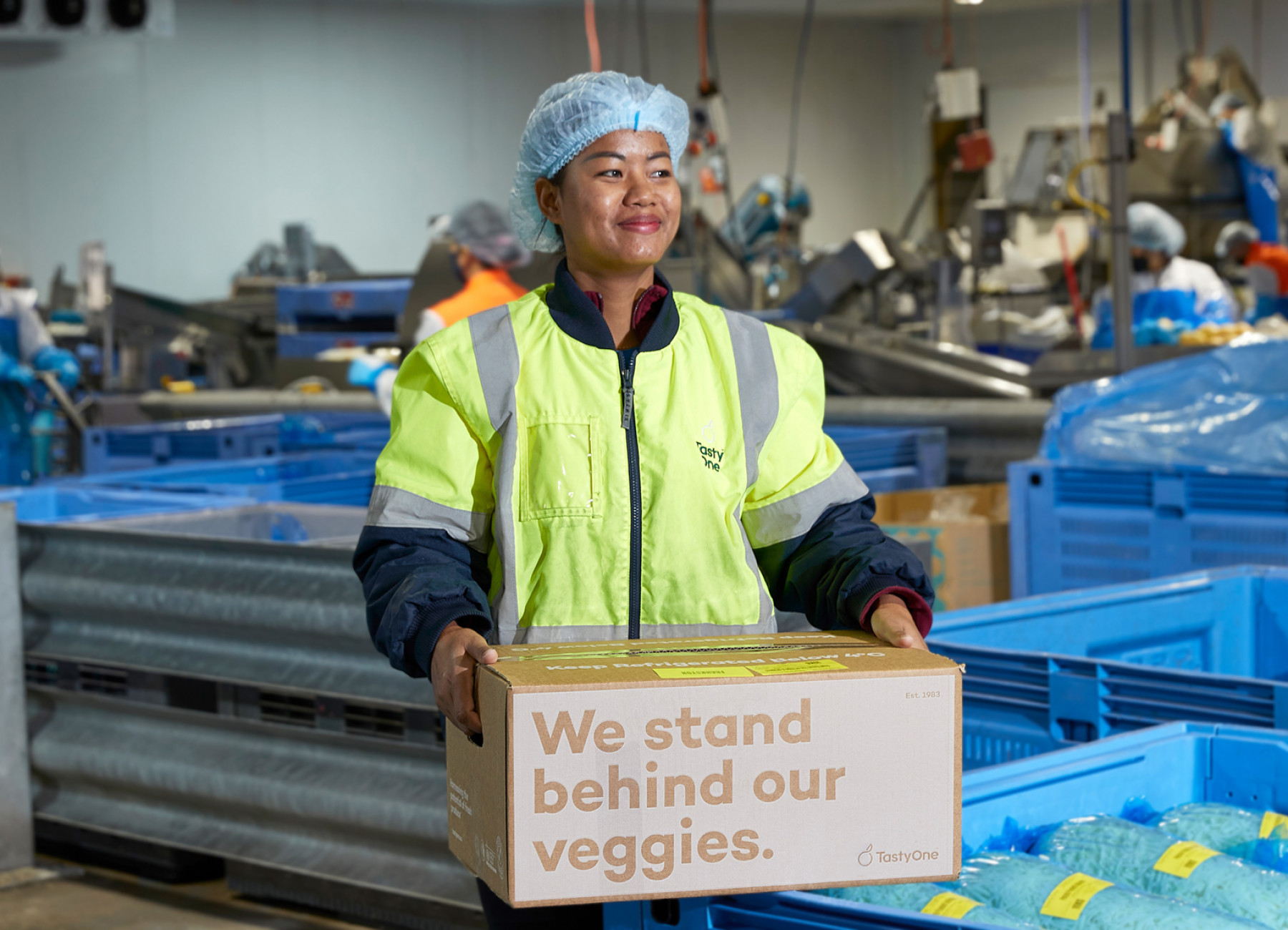
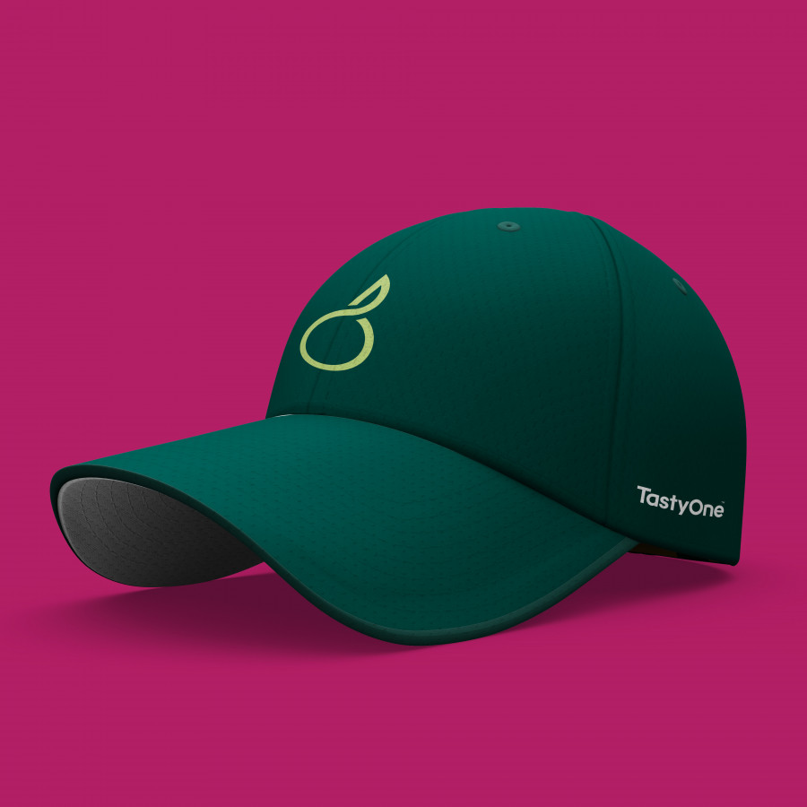
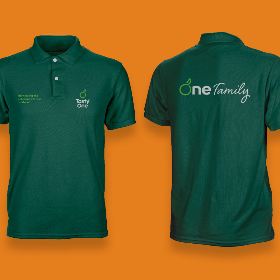
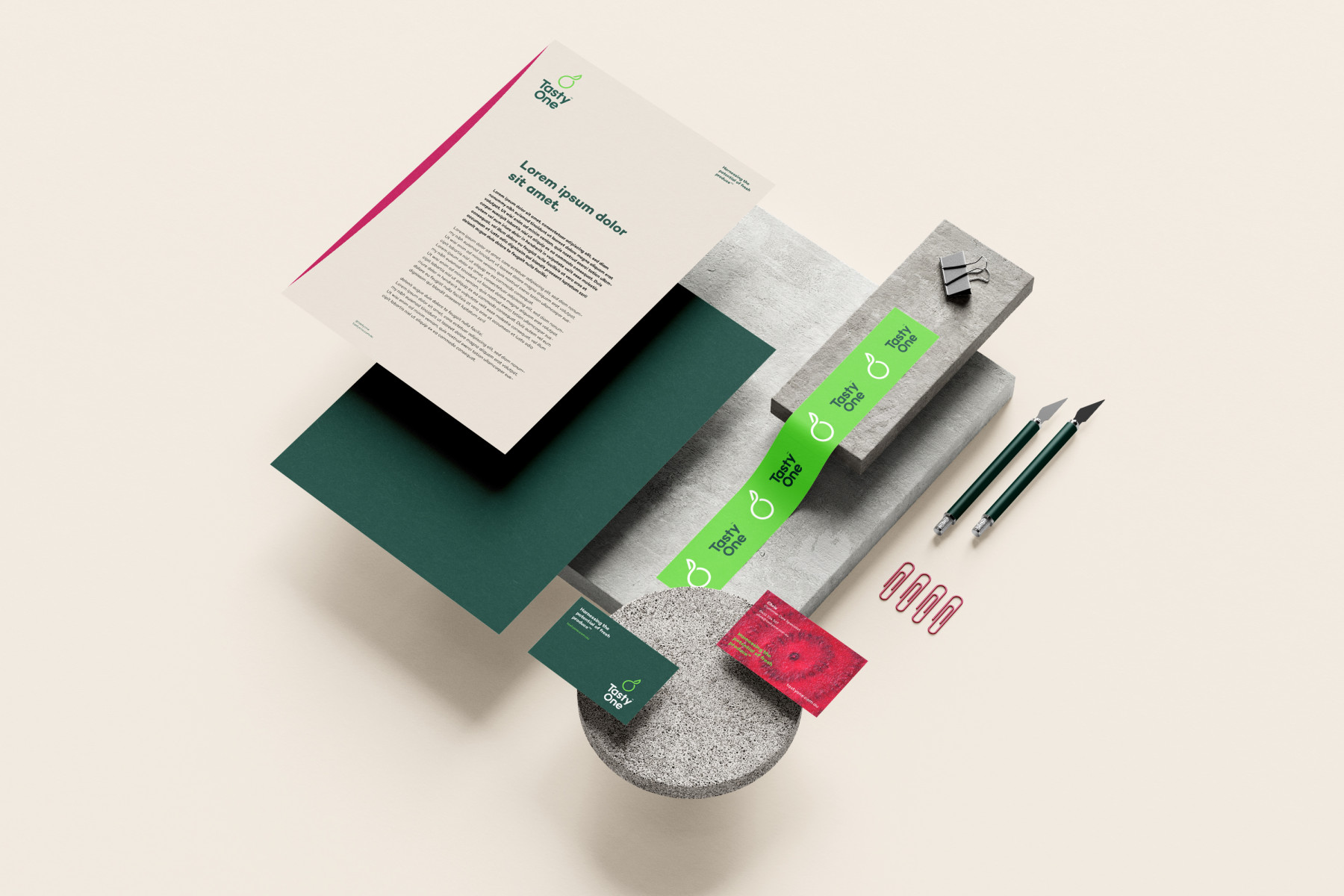
We developed a full brand style guide informing how the TastyOne brand should be treated and communicated. The colour palette was carefully designed to reflect more earthy, natural and fresh tones communicating the nature of produce and how they’re grown. The chosen brand typeface is very organic, illustrating the delicate nature of the products. And we also built a proprietary way of showcasing brand imagery and people photography, giving it a distinct and ownable look and feel.
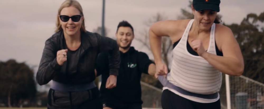
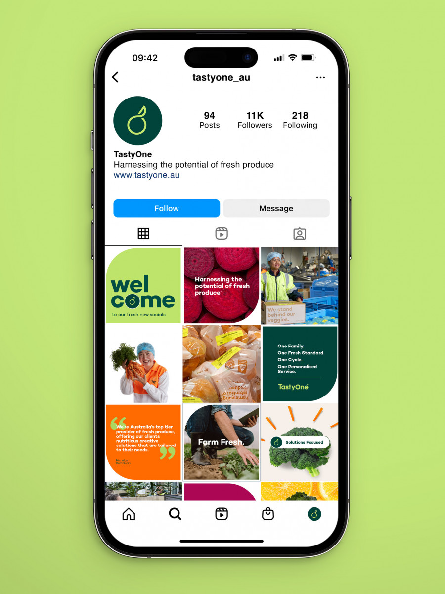
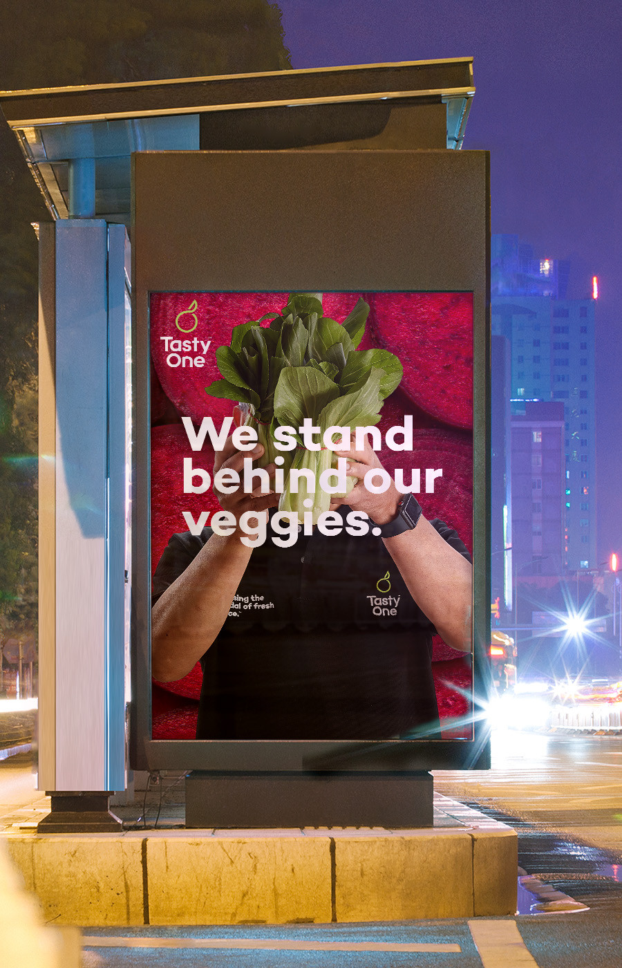
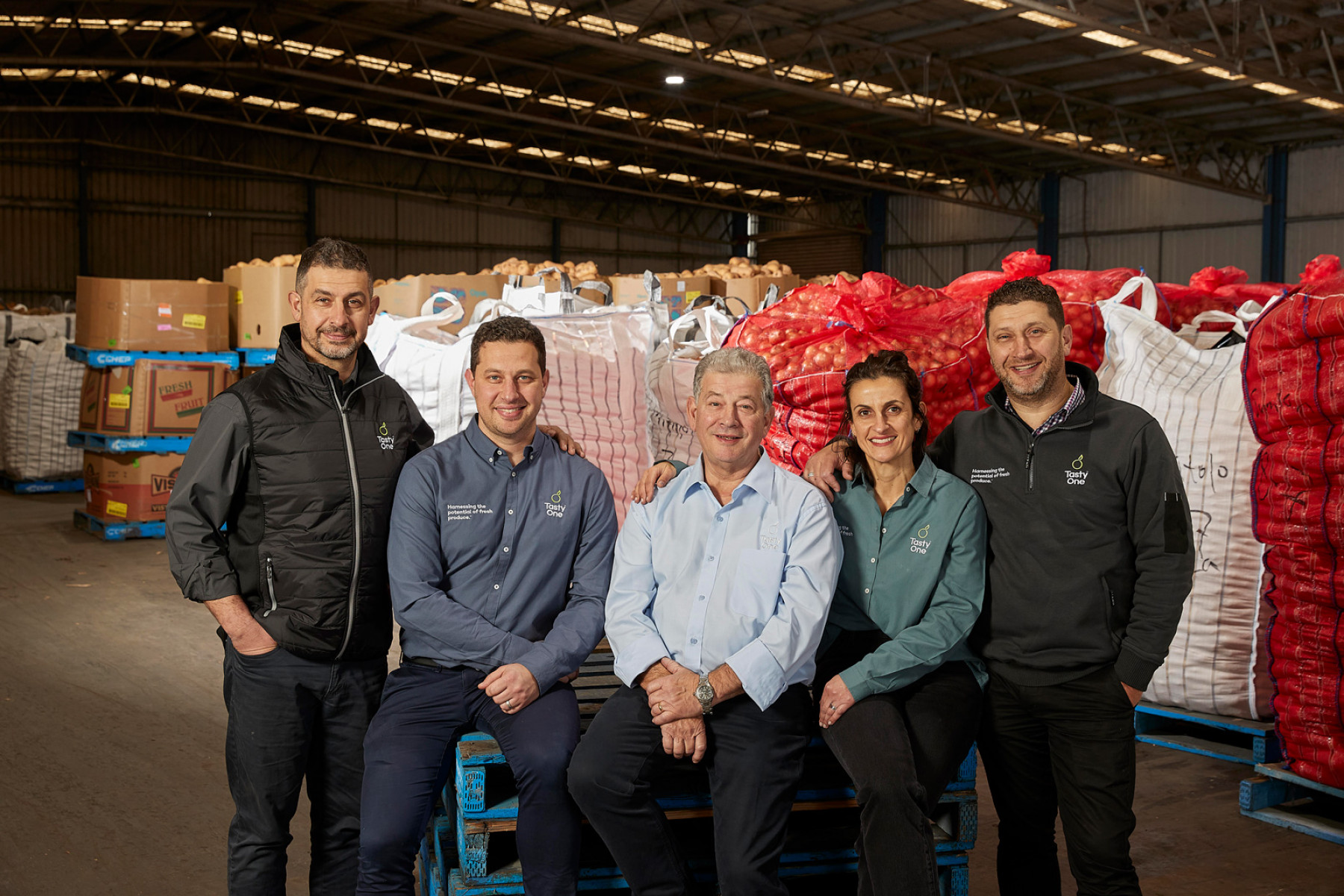
Their new brand identity was expressed and featured in many exciting ways including corporate stationery, packaging for their produce, product and promotional brochures, branded PowerPoint templates, apparel, internal engagement programs and office signage right through to brand launch videos, collaboration pieces, new website, EDM templates, socials, paid ads and photography. Enjoy the freshness of TastyOne’s new look. See the people that stand behind their veggies that ultimately make the brand who it is today.
Explore more work