Staydry
Client Staydry
Traditionally strong in the commercial healthcare space, Staydry had long been trusted by hospitals, aged care providers, and specialised retailers. But the brand was ready for its next chapter — to step out of the sterile and into the spotlight. With a growing e-commerce opportunity, it was time to reimagine Staydry as a consumer-facing lifestyle brand that felt modern, relatable, and proudly Australian.
That’s where we came in. This wasn’t just a brand identity refresh — it was a brand transformation. Our task: develop a brand strategy and identity that felt confident, uplifting, and empowering. One that encouraged customers to live freely, without shame or stigma. Central to this new direction was reinventing the iconic penguin mascot — evolving it into a more vibrant, expressive symbol that reflected the brand’s renewed energy, optimism, and humanity.
Brand Strategy
Our brand strategy started by challenging everything the category stood for. After workshops and competitor deep-dives, one truth stood out: the incontinence market was emotionally tone-deaf — dominated by cold, clinical branding that failed to connect. We saw an opportunity to completely reposition Staydry from a product people hide, to one they can own with pride.
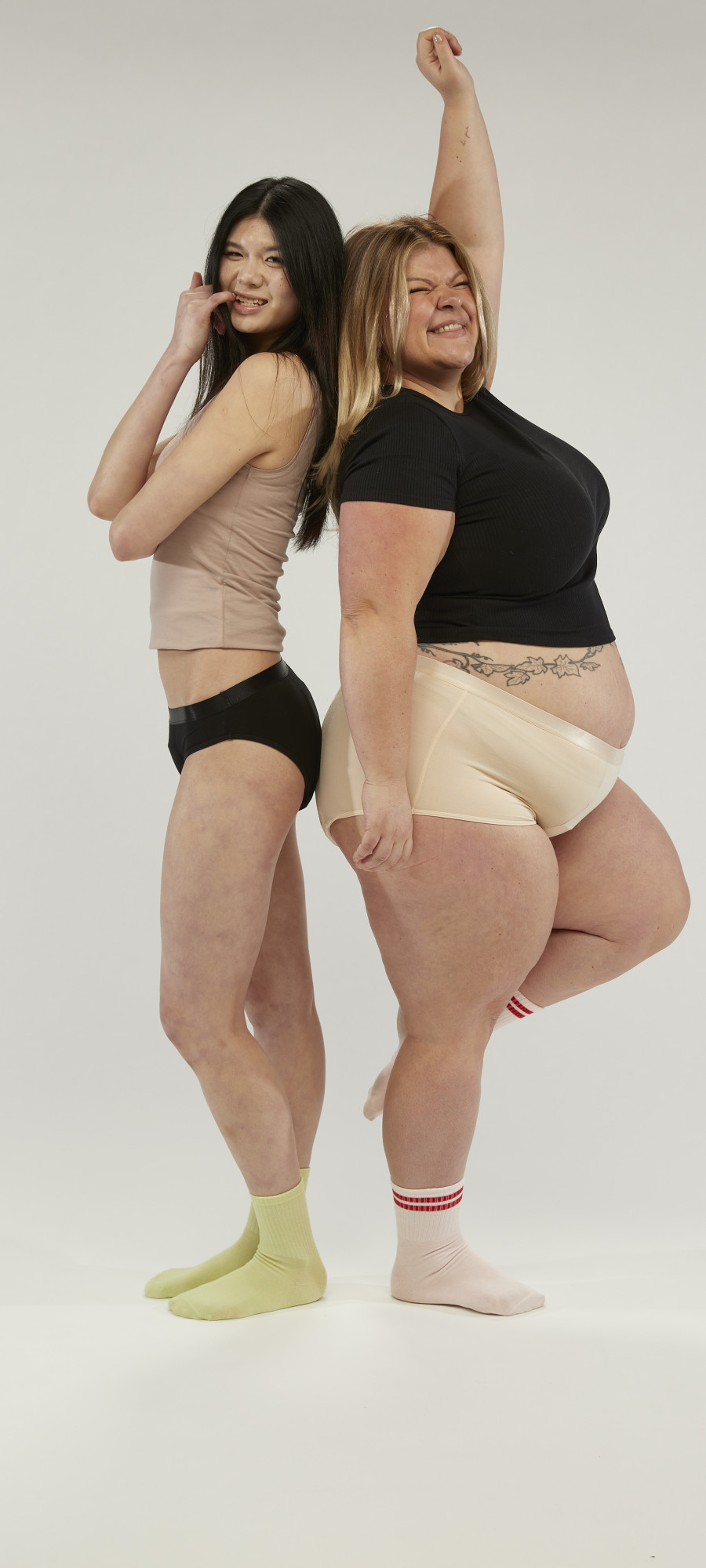
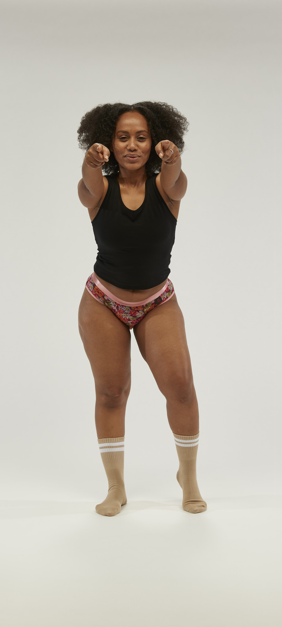
Where others focused on discretion, we focused on liberation. We shifted the story from humiliating, inconvenient, and unsexy to cool, proud, and unapologetically confident. The brand now celebrates individuality and self-expression — empowering people to embrace life without hesitation.
This transformation went far beyond visuals — it was about changing the conversation. We stripped away the stigma and rebuilt the brand through an emotional lens. Staydry now sits comfortably alongside lifestyle and wellness brands, with a tone that’s bold, cheeky, and full of life — speaking to a community ready to live loudly, not quietly.
At the heart of this transformation is a simple but powerful brand platform: the three F’s — Form (styling and design), Function (staying dry), and Feeling (confidence). Together, they express the brand’s purpose — to not just meet a need, but to celebrate it.
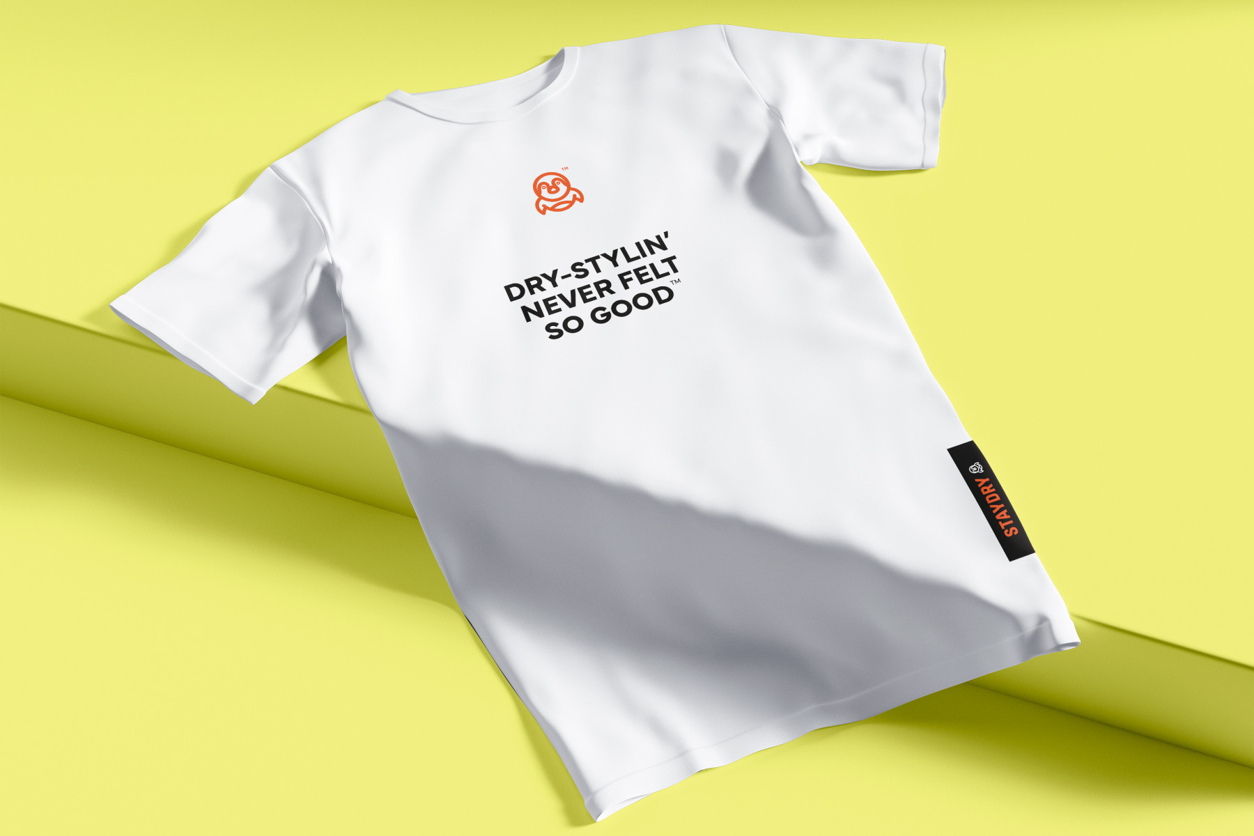
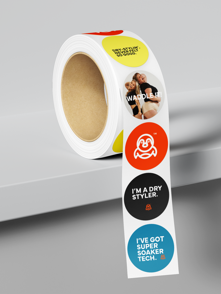
This comes to life in the new brand communications and tagline:
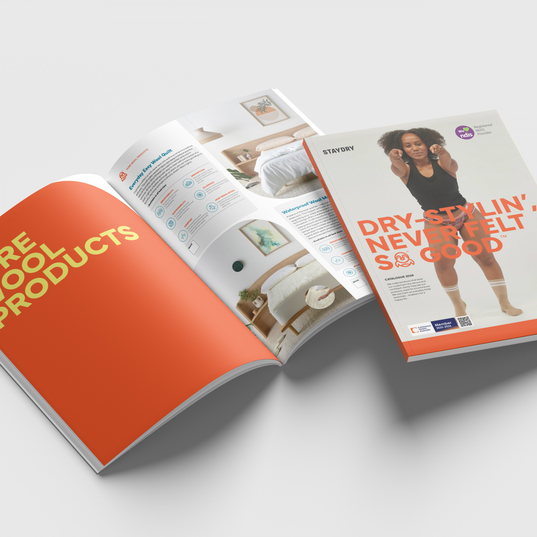
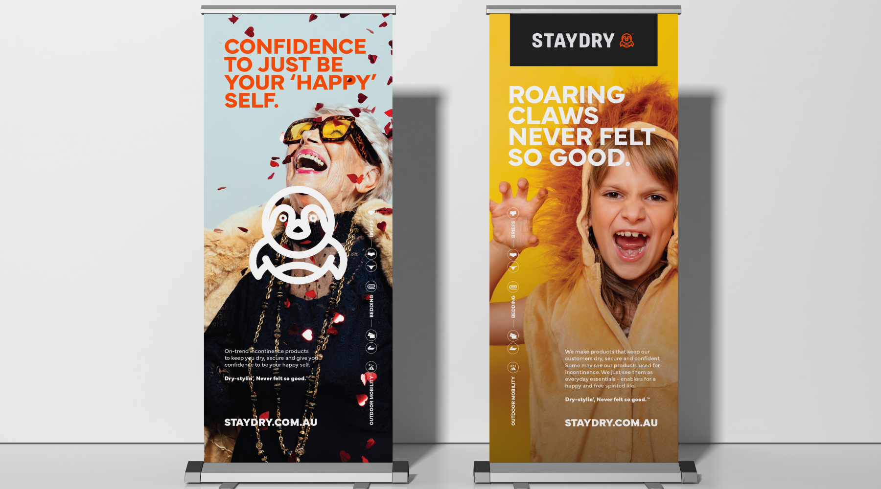
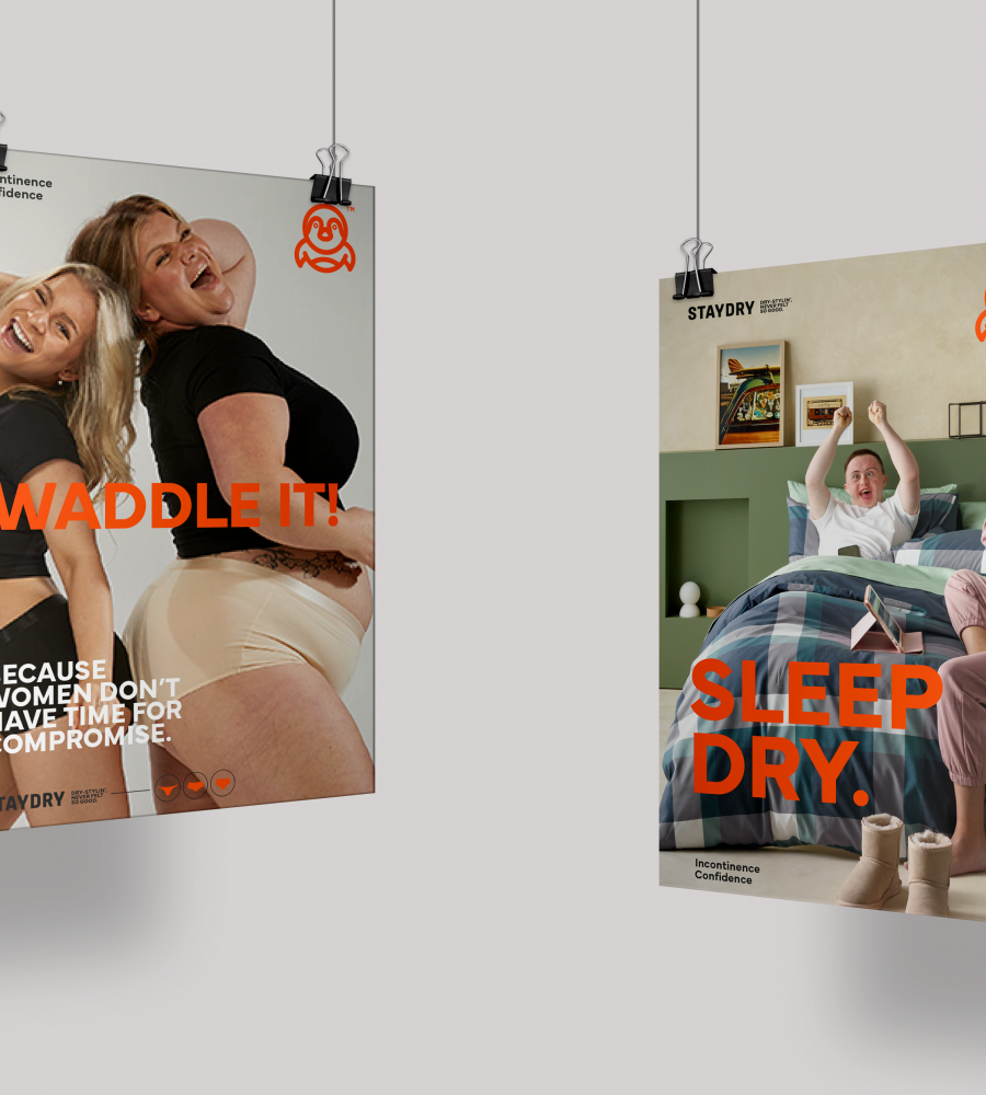
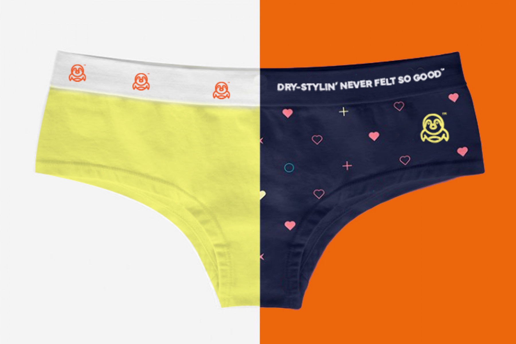
“Dry-stylin’, never felt so good™.”
An empowering, fashion-forward statement that’s confident, catchy, and just the right amount of cheek. It perfectly captures Staydry’s evolution — a lifestyle brand with personality, not pity.
Creative
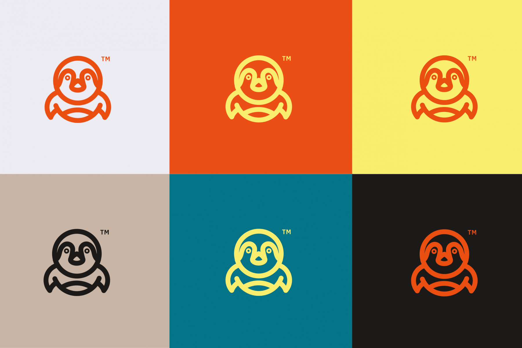
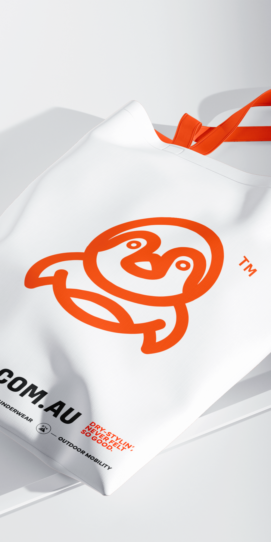
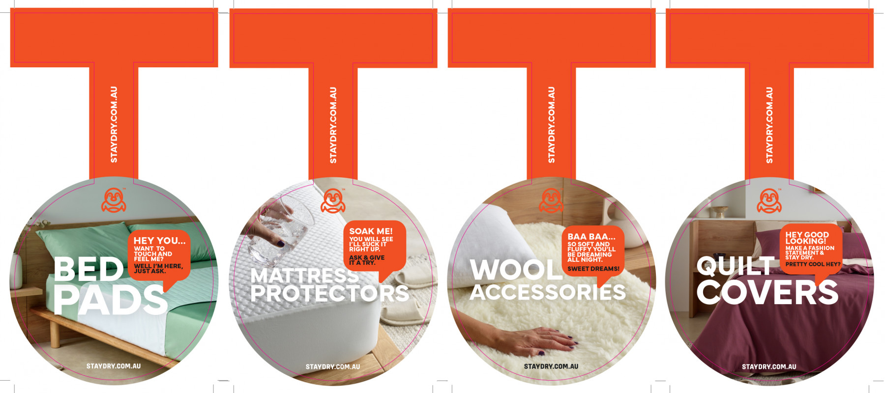
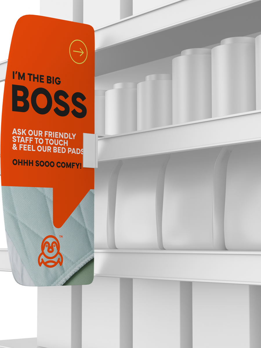
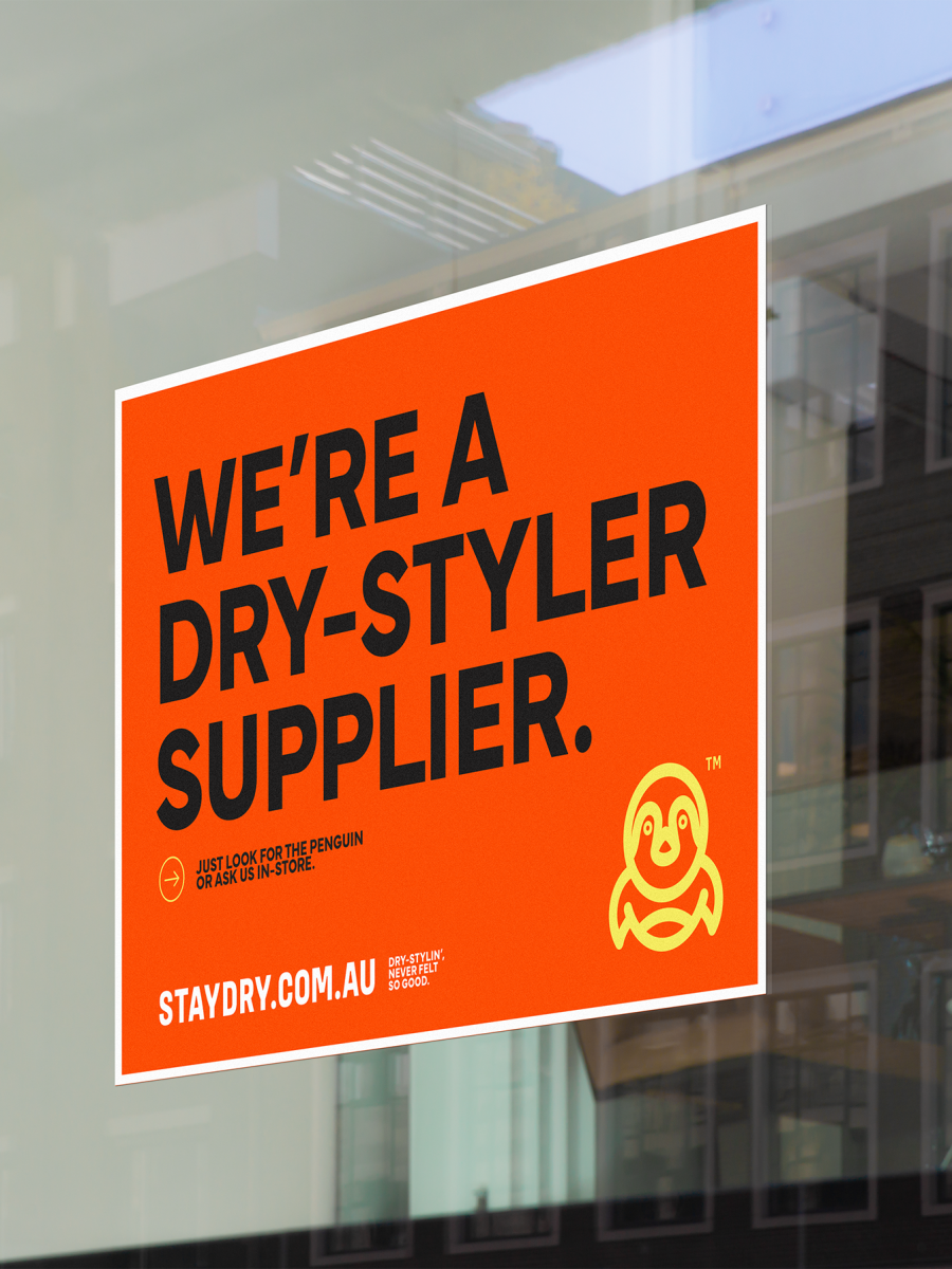
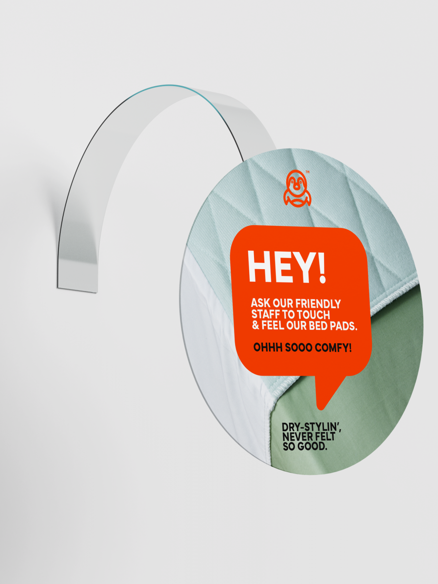
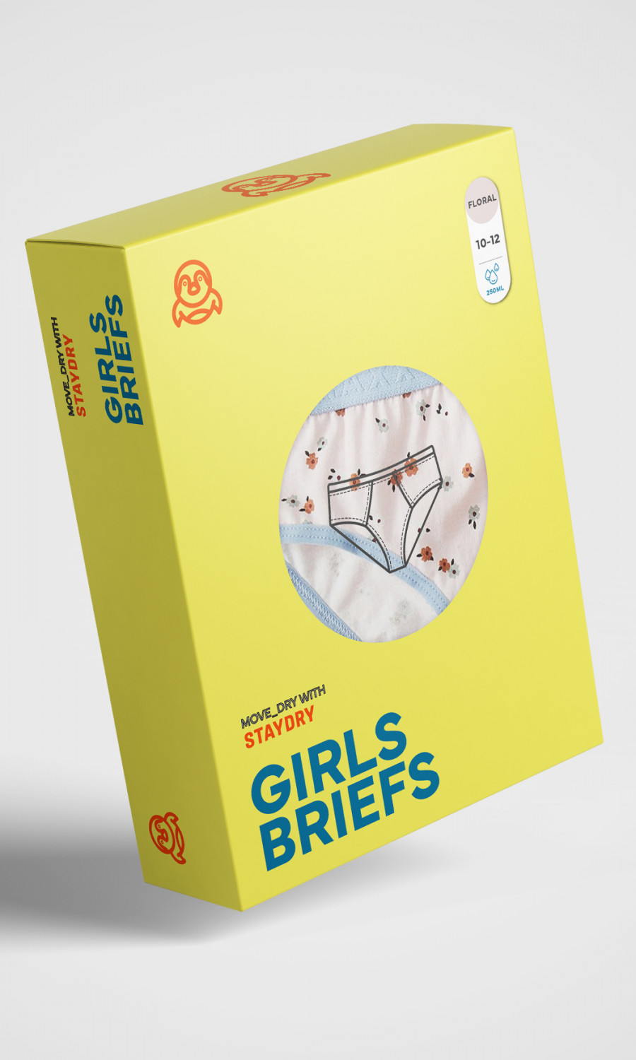
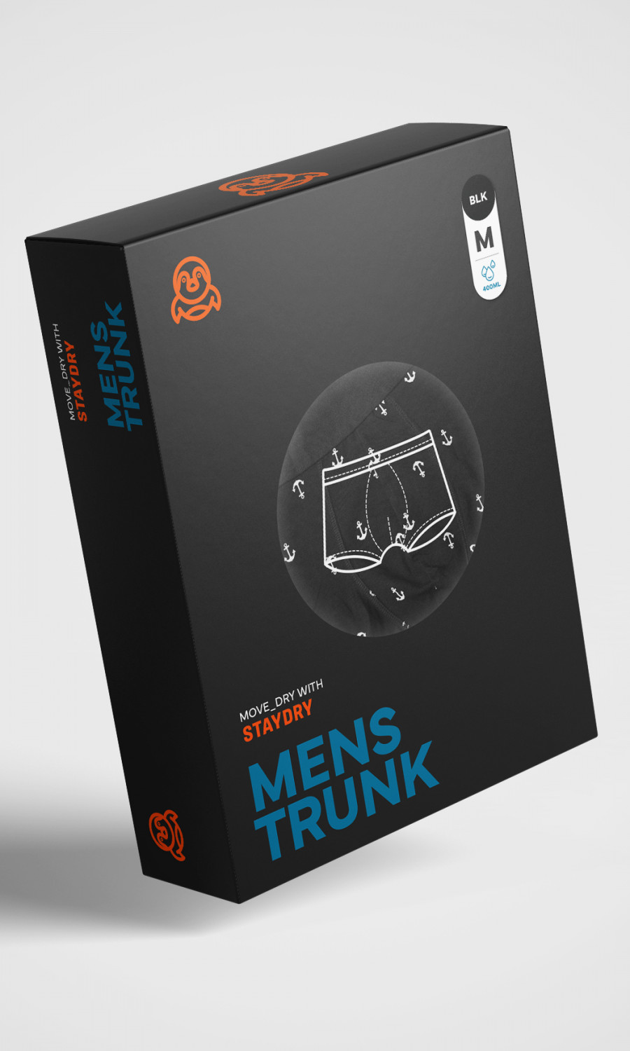
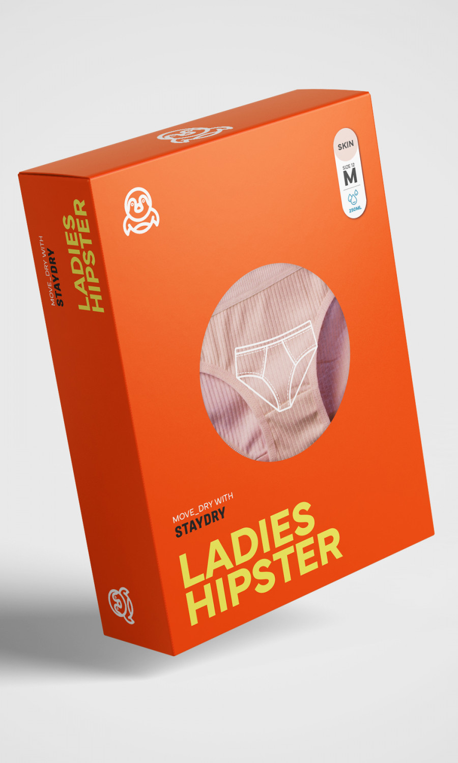
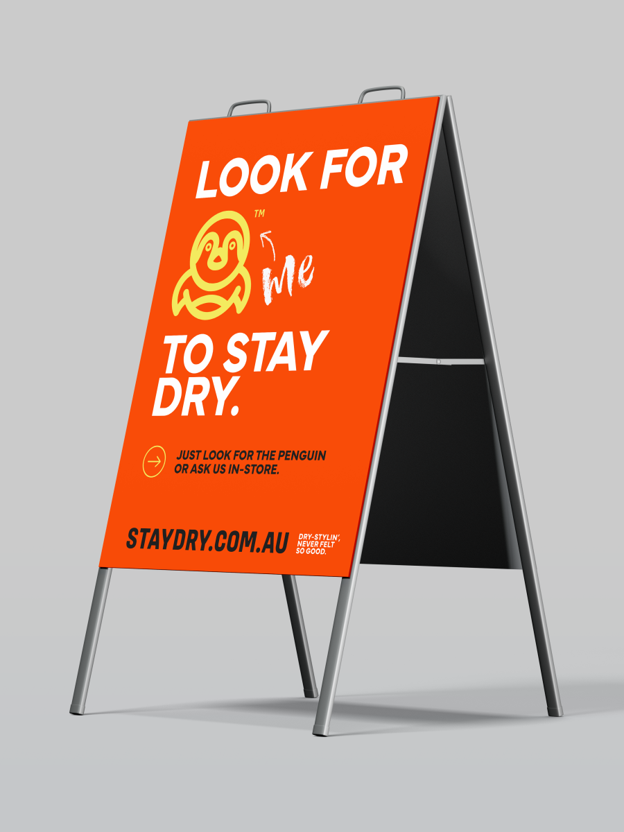
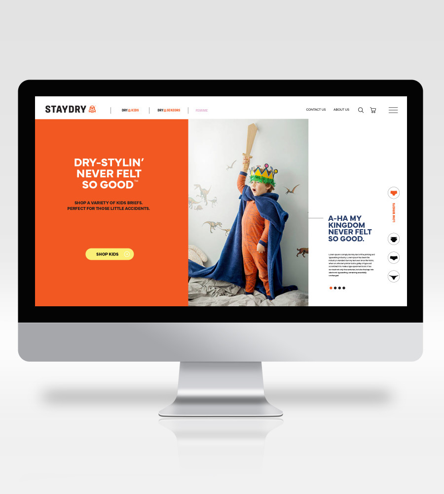
Visually, we unleashed Staydry’s personality. The once-traditional penguin was reborn as a spirited, character-driven mascot — fun, expressive, and full of charm. It’s the perfect symbol of the brand’s newfound confidence: approachable yet proud, simple yet full of attitude.
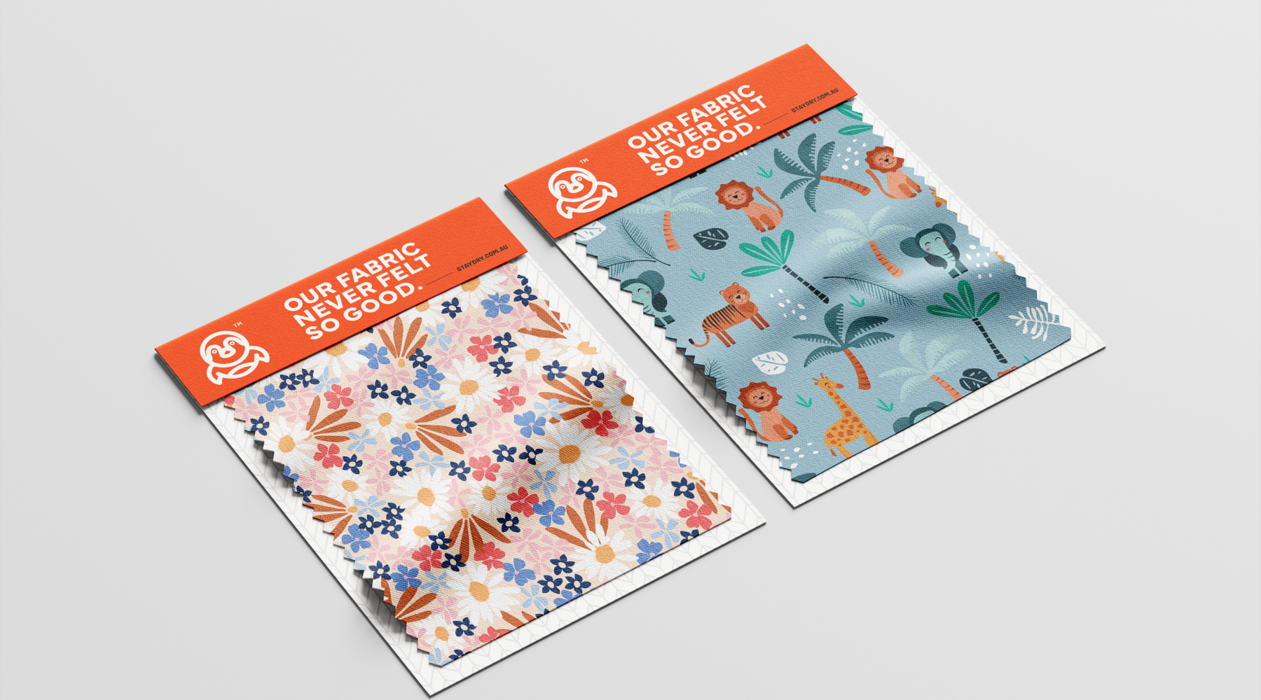
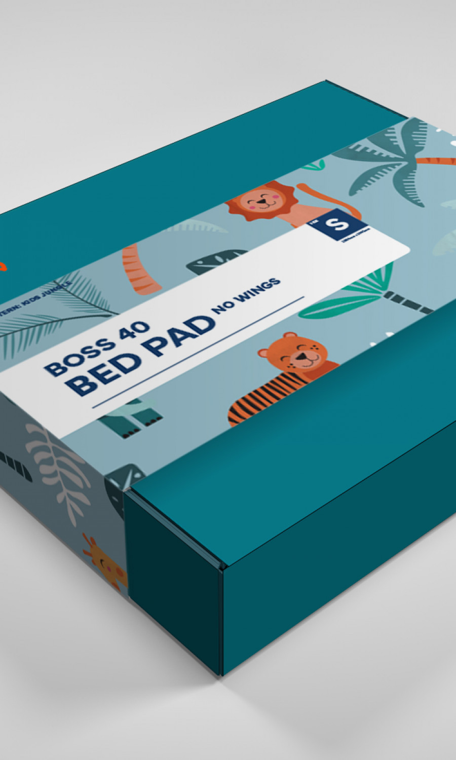
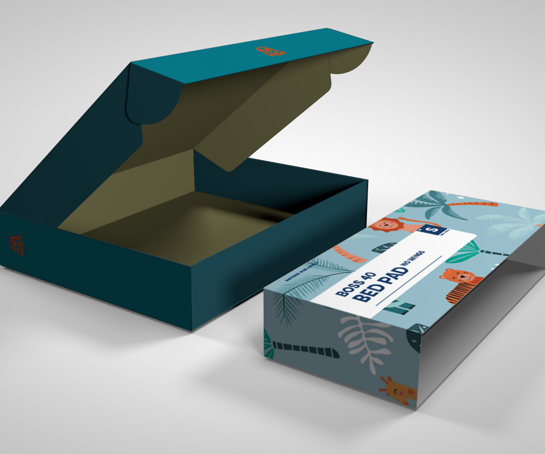
We paired this with a vibrant, refined colour palette — bright, modern, and optimistic. Every hue was chosen to bridge generations — from energetic families to stylish seniors — striking the perfect balance between playful and polished. The design language is minimalist but brave, giving the brand room to breathe while keeping its human warmth front and centre.
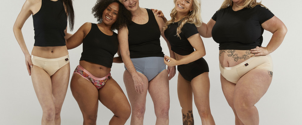
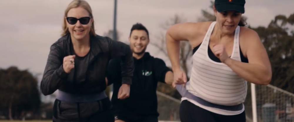
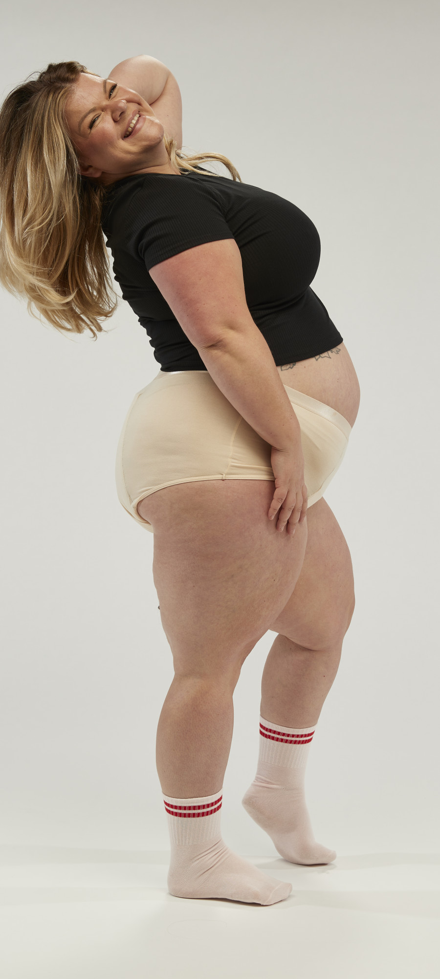
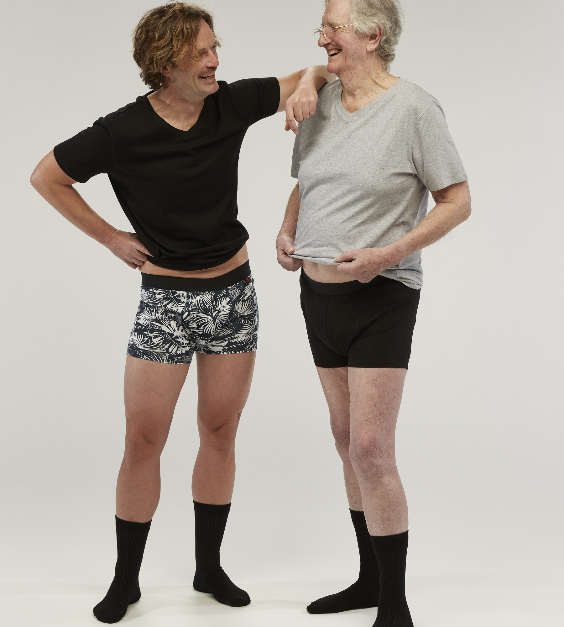
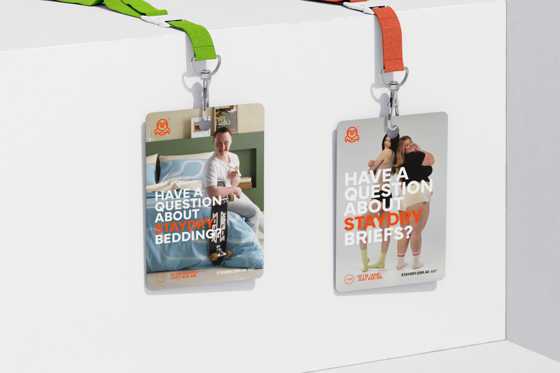
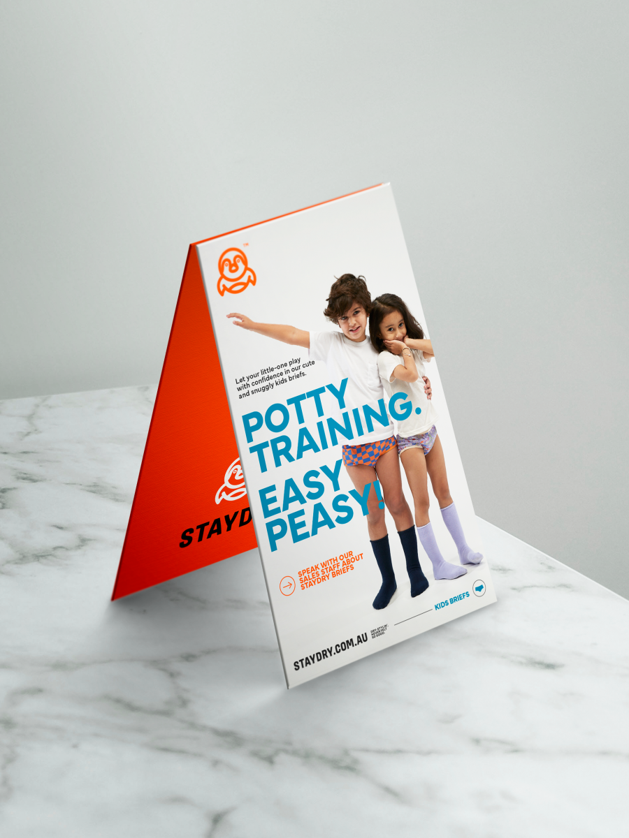
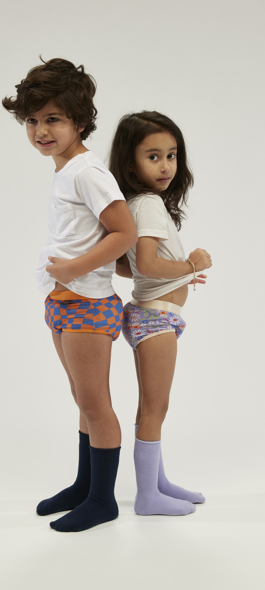
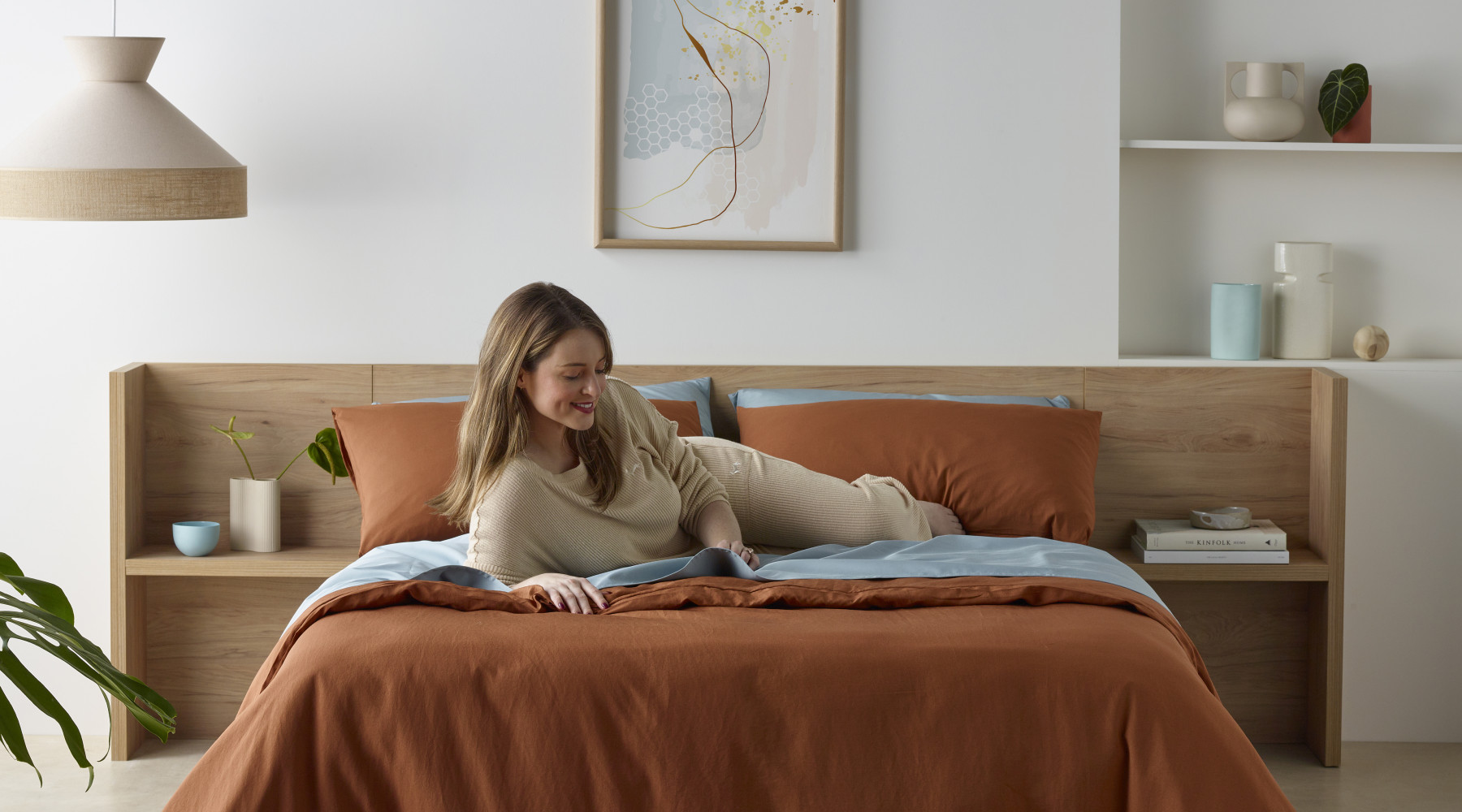
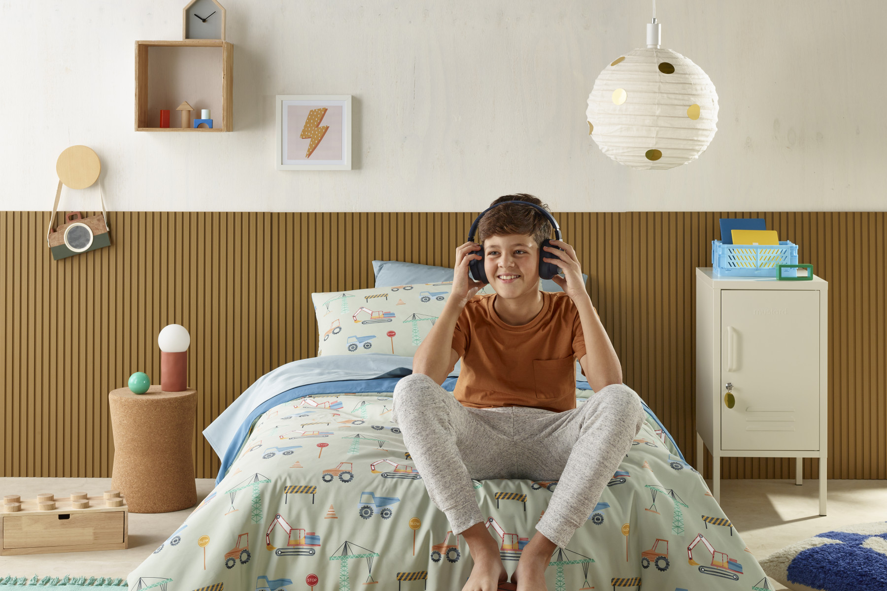
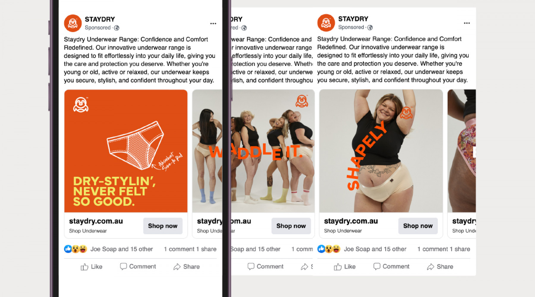
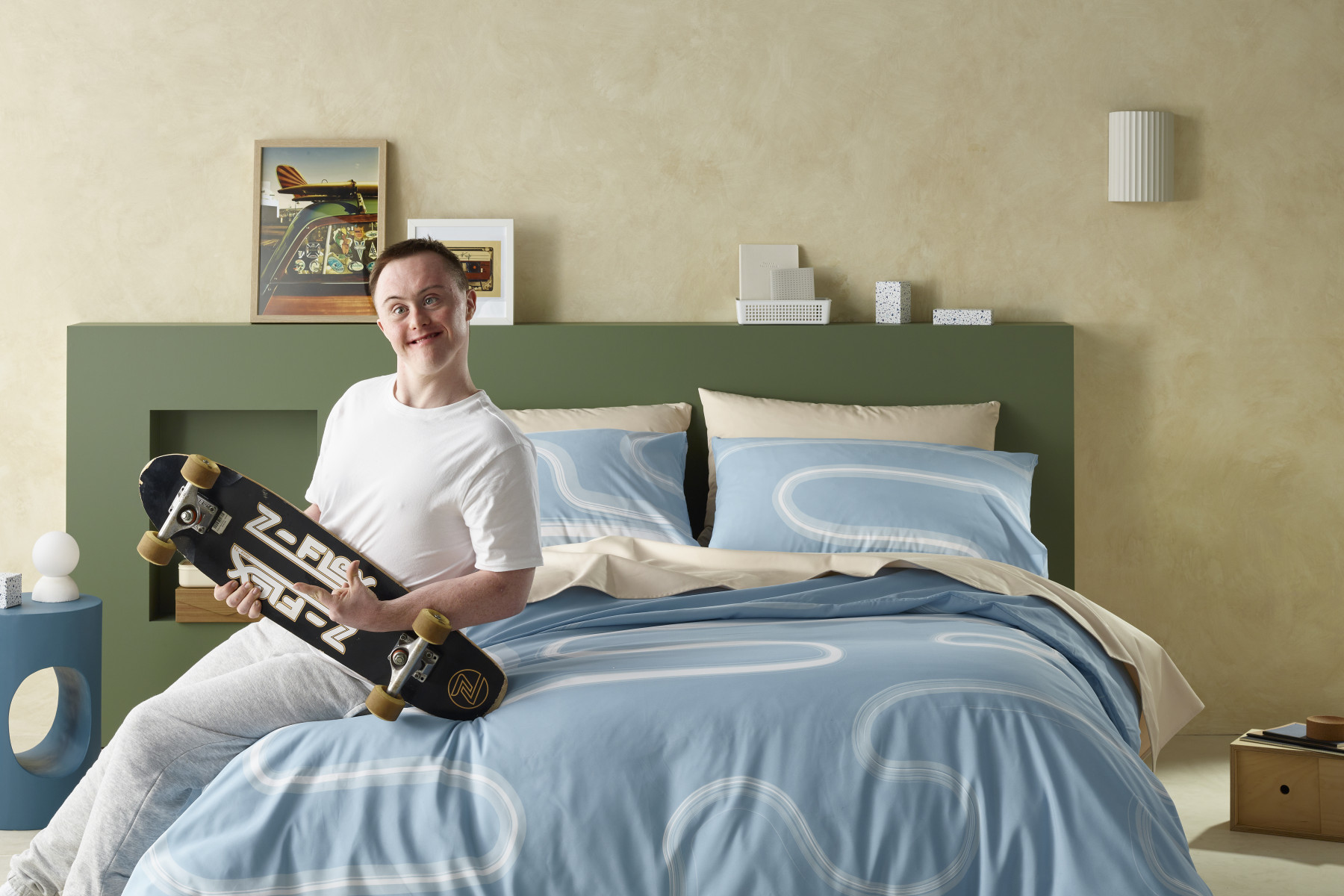
Imagery was key to breaking the category mould. Gone are the sterile product shots and awkward smiles. Instead, our brand world is alive with real people living fully — laughing, dancing, and dressing up, unrestrained by category shame. From kids to grandparents, every image radiates freedom, confidence, and a sense of fun.
Clean, fashion-inspired typography and confident layouts complete the system, echoing the cues of a modern lifestyle brand rather than traditional healthcare. The result is a distinctive, upbeat brand identity that refuses to whisper. It stands proud, bold, and unapologetically human — proving that even the most functional products can live beautifully through great branding.
Explore more work