Ridgewater Homes
Client Ridgewater Homes
Ridgewater Homes is a Melbourne-based volume home builder redefining what flexibility and personalisation mean in modern homebuilding. Backed by the RW Lifestyle Group, they’ve built a passionate following across Melbourne’s west and outer regions by doing what most volume builders can’t — tailoring and customising each floor plan around the individual. Where others offer standard templates, Ridgewater builds around people — creating homes that feel truly lived-in before the first brick is laid.
To strengthen the brand’s foundations, we developed a comprehensive brand strategy and brand identity program that began with deep discovery. From internal staff engagement and director workshops to one-on-one interviews with 20 clients and quantitative research with over 3,000 customers, we set out to understand every facet of the Ridgewater experience. We uncovered powerful insights into how people feel when building a home — the excitement, the stress, and the vulnerability that come with one of life’s biggest investments. Our goal was to help Ridgewater transform that complex journey into one that feels easier, clearer and genuinely inspiring.
The research revealed that while Ridgewater’s build quality was exceptional, its brand communications and customer experience hadn’t evolved to reflect that same level of care and craftsmanship. The visual identity felt tired and corporate — missing the emotion, energy and optimism that underpin the Ridgewater experience. It needed rejuvenation — a new story, a new voice and a new sense of purpose.
This became the foundation for reimagining Ridgewater’s brand identity — a brand that’s human-centred, excellence-driven, diverse in perspective, and designed to help every customer, and every team member, truly shine.


Brand Strategy
Our brand strategy for Ridgewater Homes began with listening — deeply. Through a series of immersive brand workshops with directors, internal teams and sales consultants, we uncovered what truly made Ridgewater different. These sessions revealed a business defined by craftsmanship, care and flexibility — but also a desire to express more of its heart: the human emotion behind every home built.
To complement these insights, we mapped every stage of the customer journey — from initial enquiry to final handover — identifying the emotional highs and lows that define the homebuilding experience. Through one-on-one interviews and large-scale research with over 3,000 customers, we learned that building a home isn’t just a transaction; it’s a milestone. It’s emotional, exhilarating, and at times overwhelming. Our job was to help Ridgewater create a journey that felt simpler, more transparent and truly uplifting.
At the centre of this repositioning sat a new brand essence:
“Exceptional homes built uniquely around you to feel inspired.”
It redefined Ridgewater’s purpose — from simply constructing houses to creating spaces that are personal, meaningful and emotionally resonant.
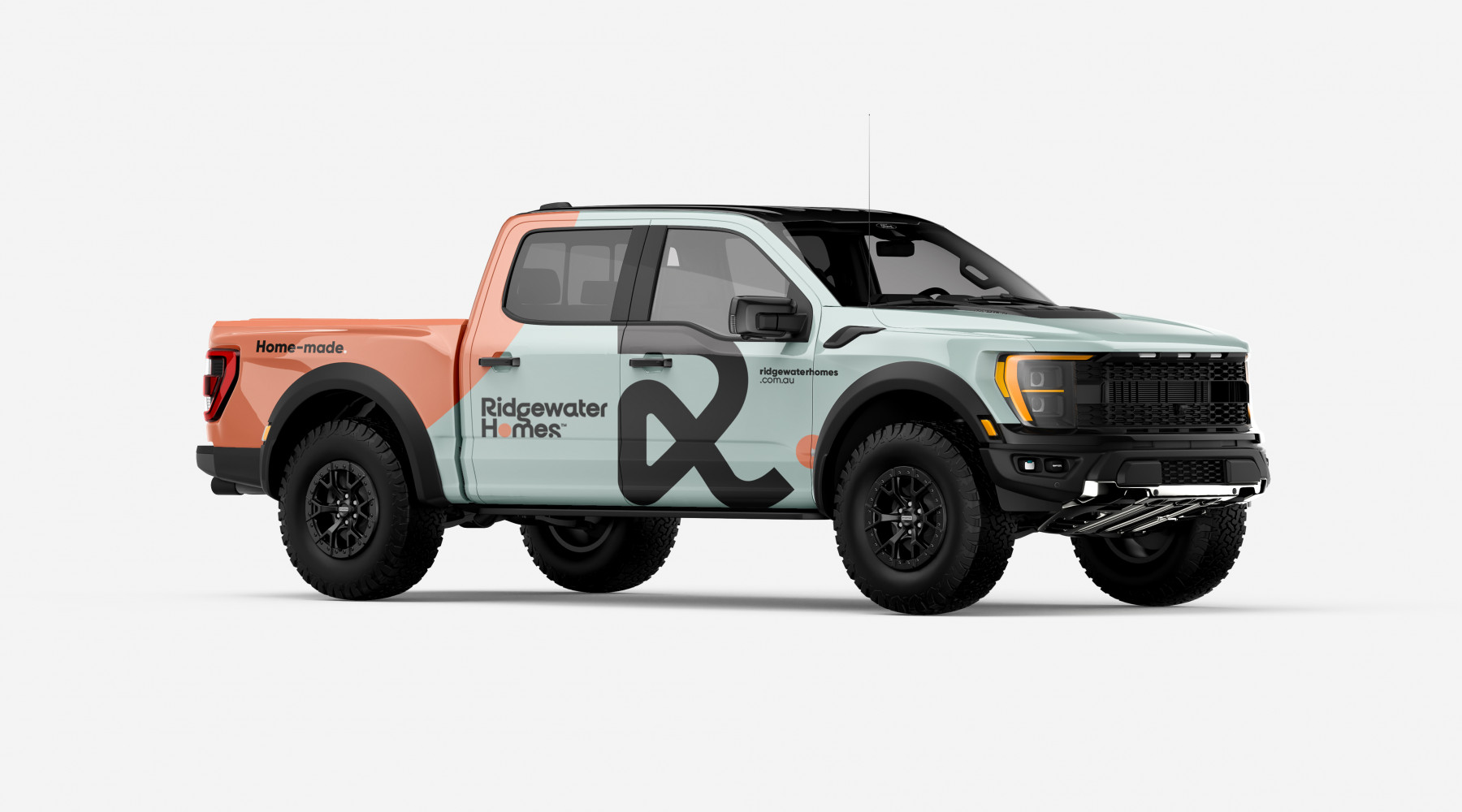
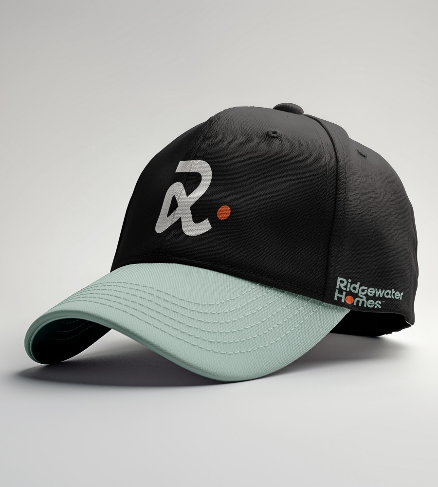
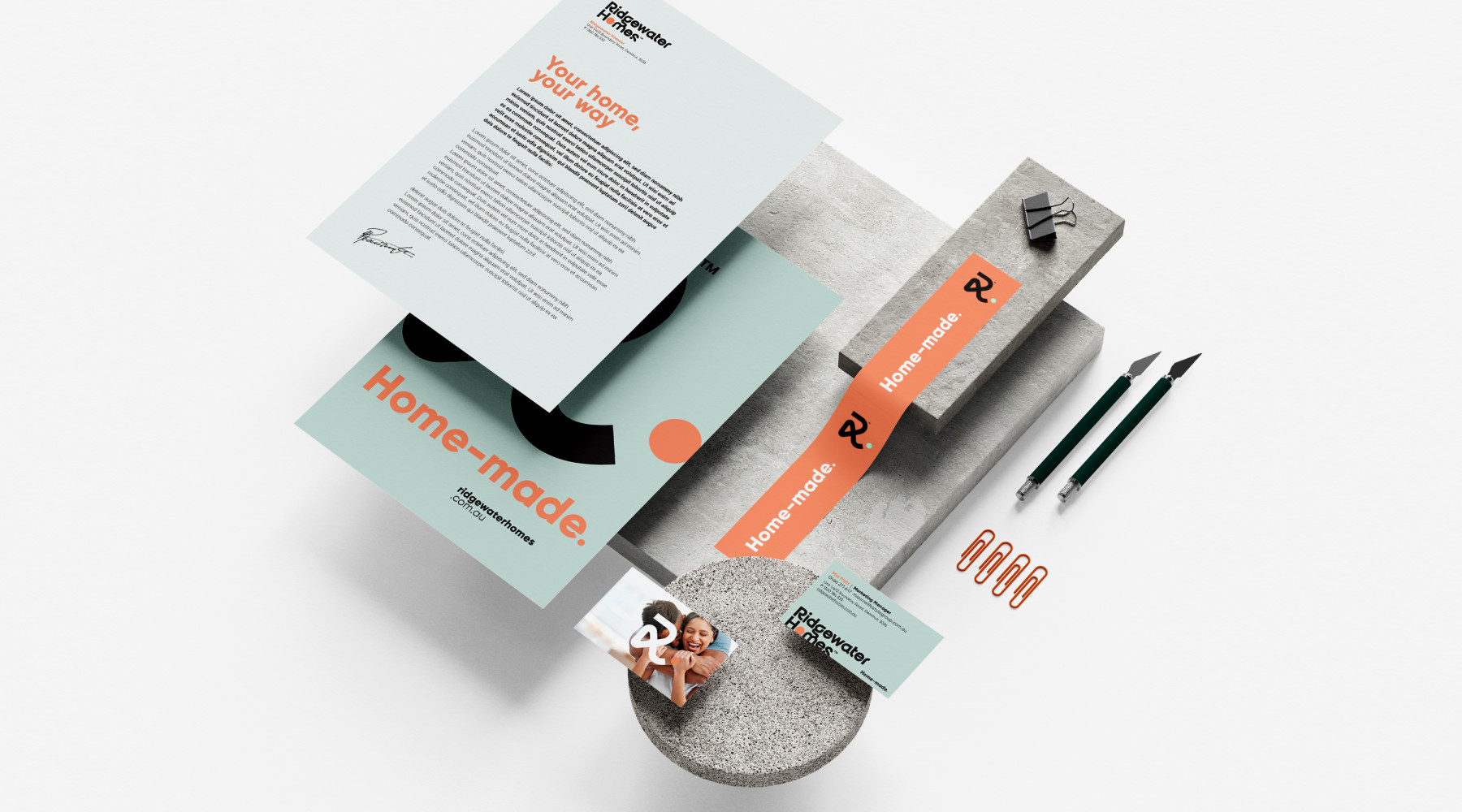
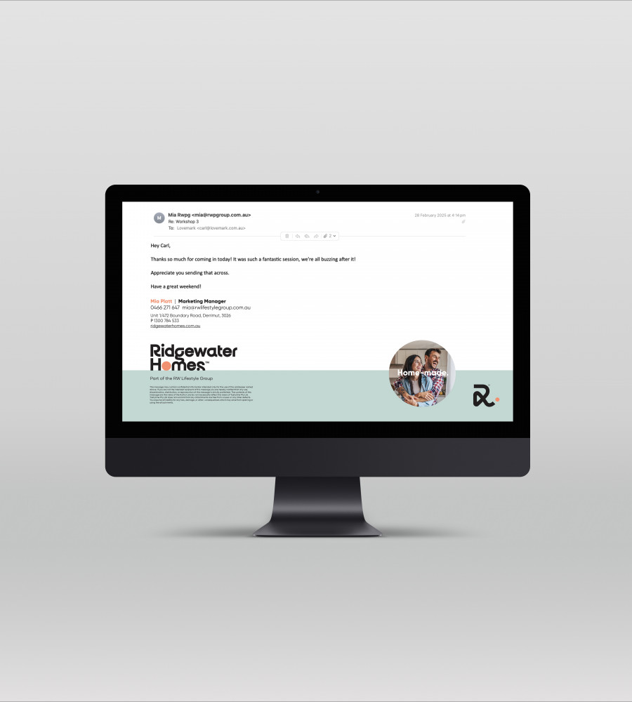
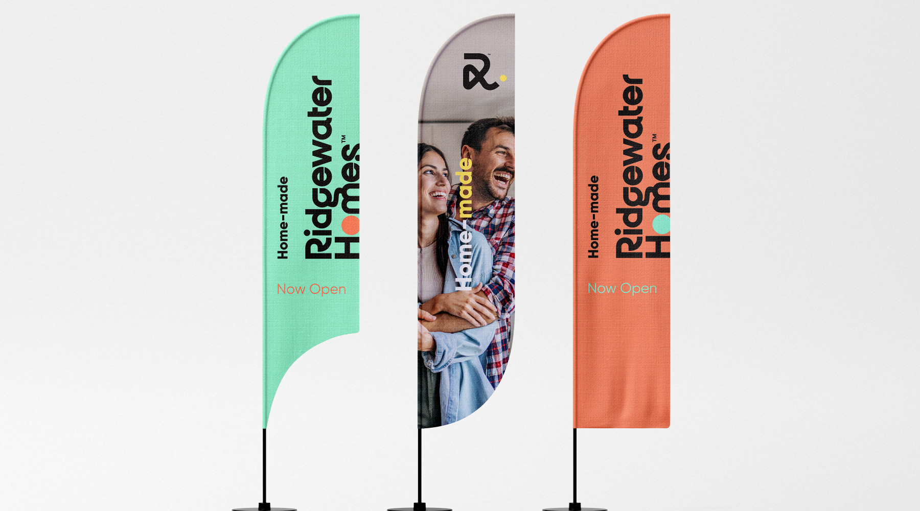
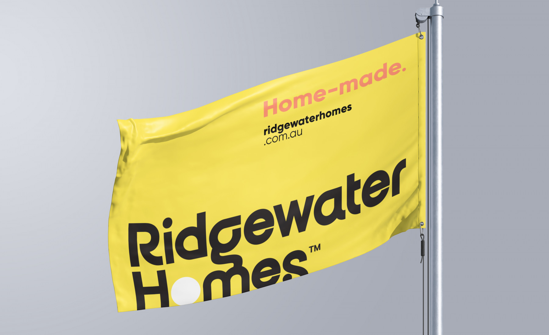
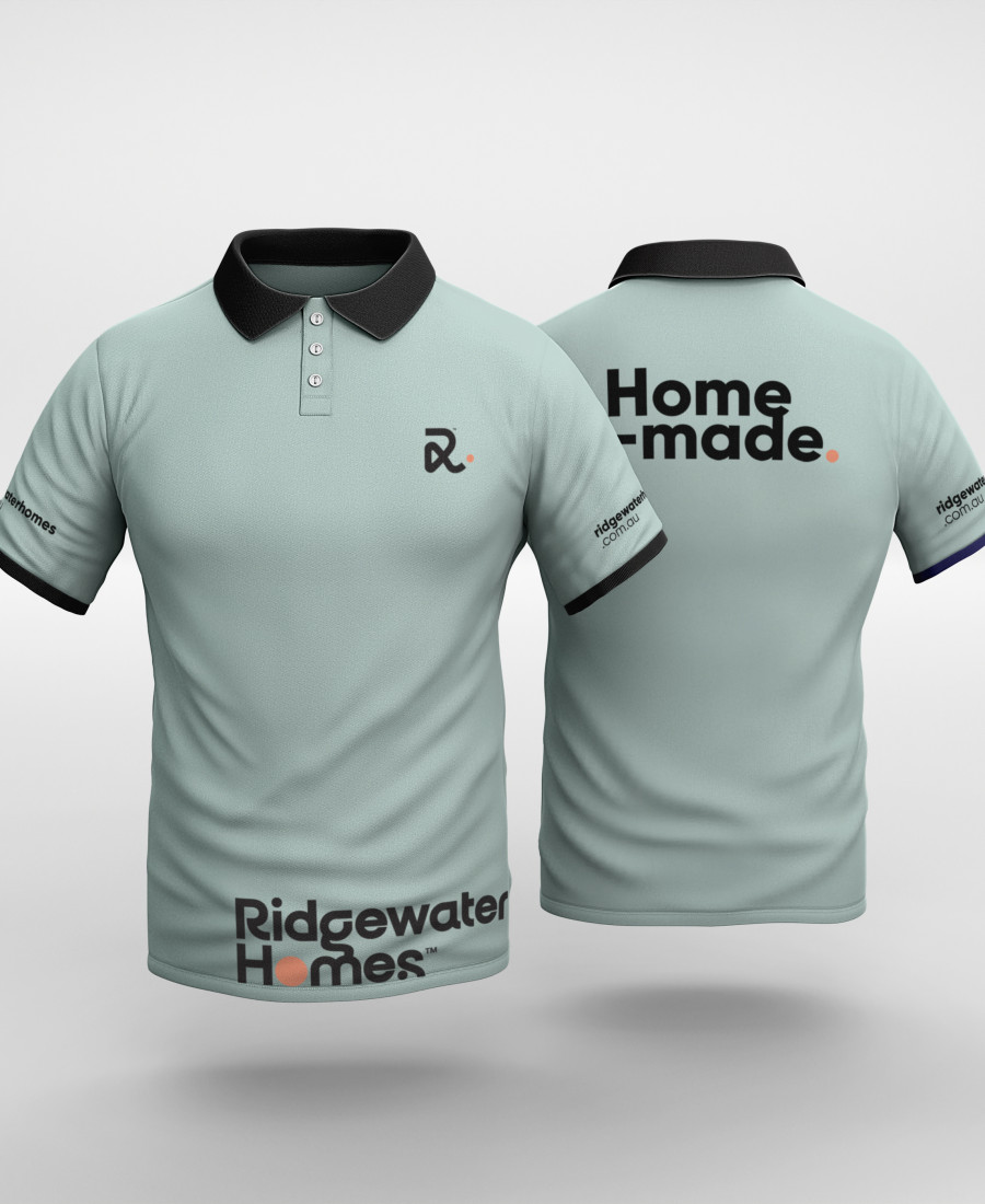
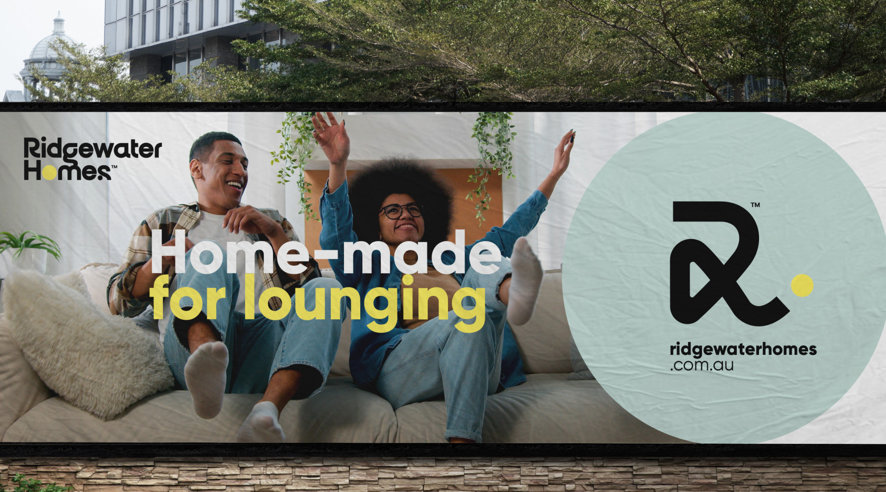
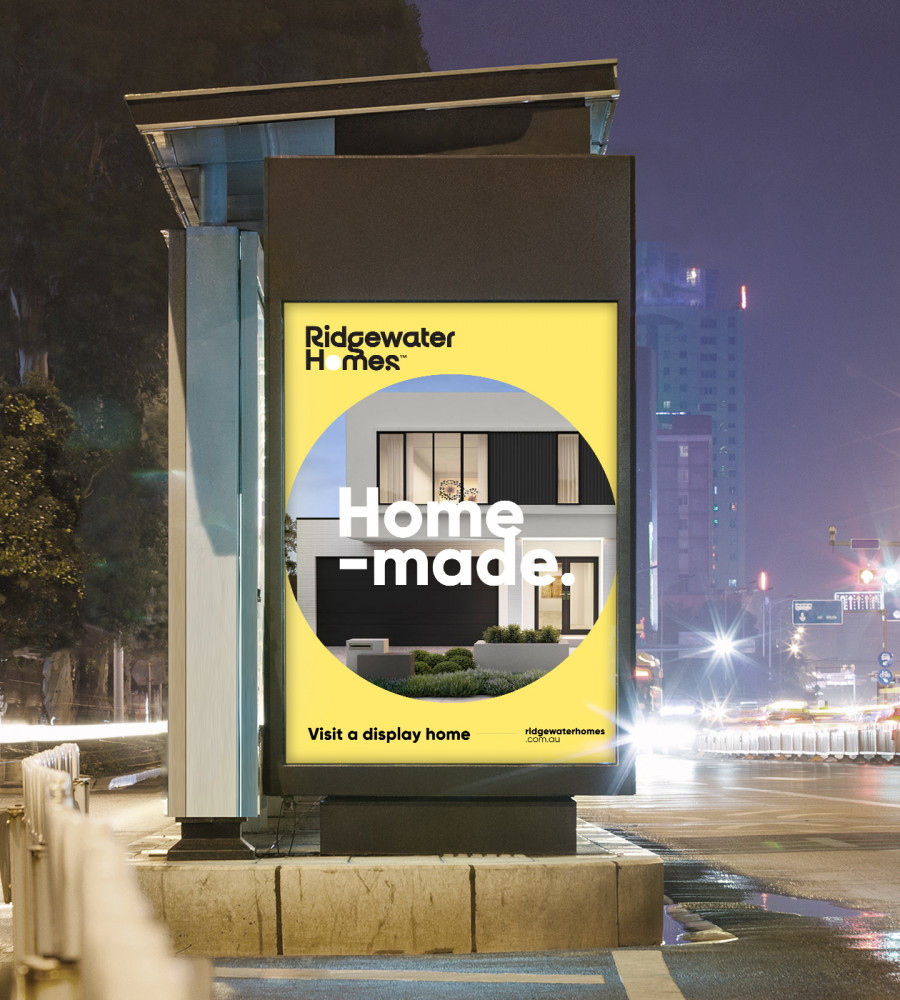
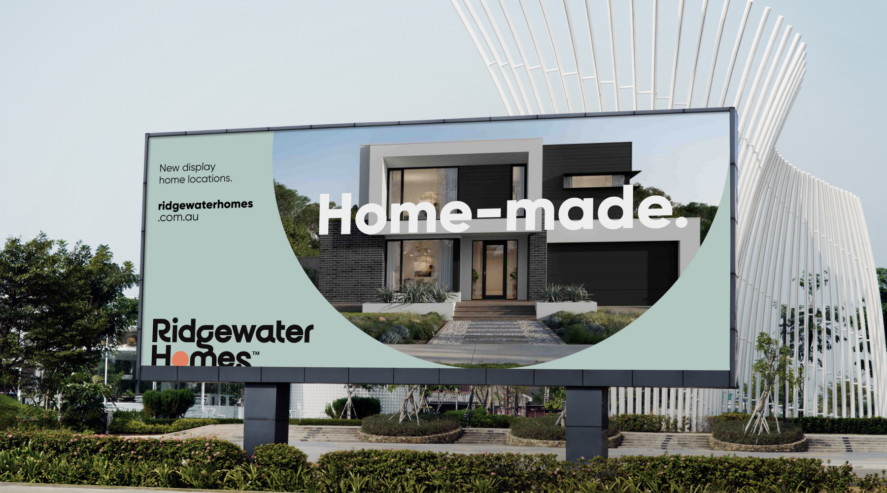
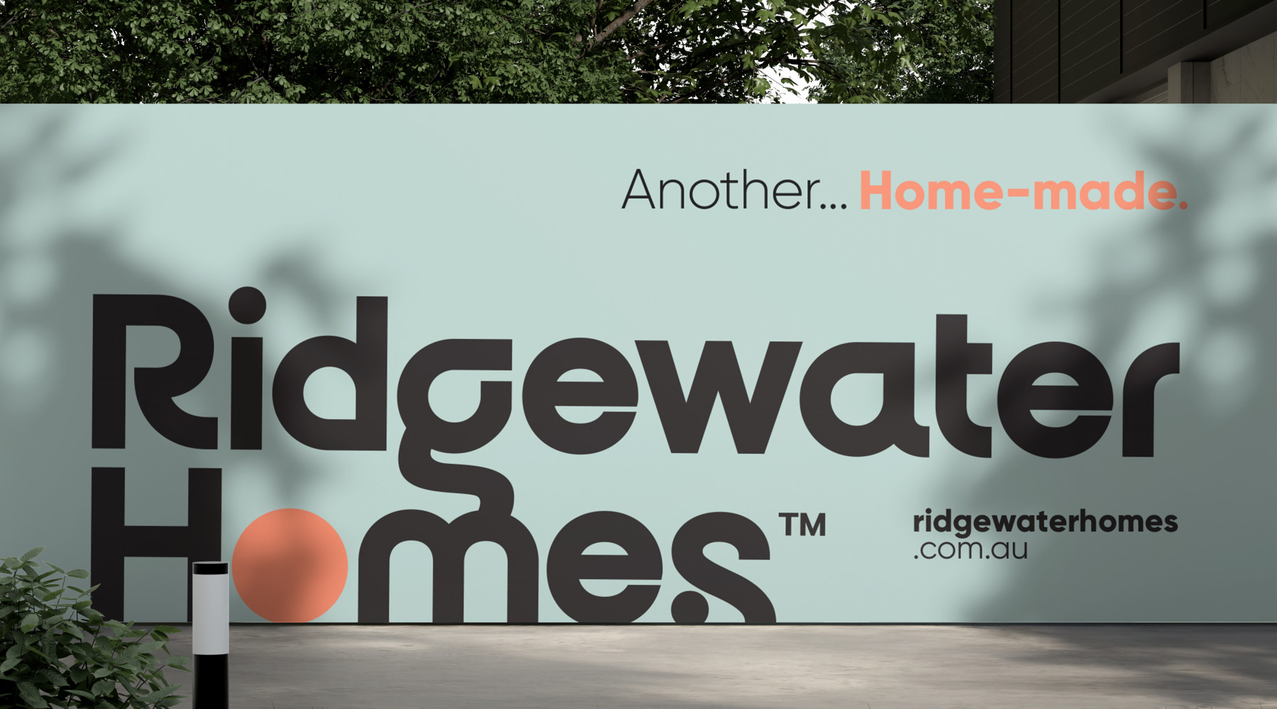
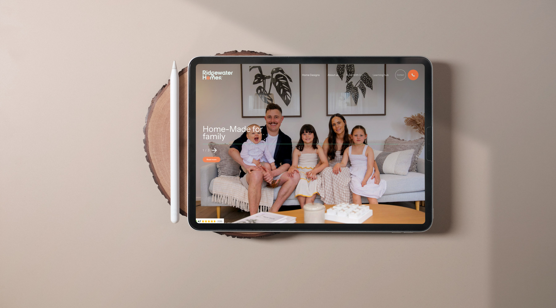
From this, a simple yet powerful tagline emerged: Home-Made.
A phrase that perfectly captures Ridgewater’s dual promise — the craftsmanship of a home built with precision, and the pride of a homeowner who has shaped every detail. It symbolises collaboration and belonging — a home not just built for you, but with you.
Strategically, this thinking guided every aspect of the brand’s transformation. We defined four foundational brand pillars — Human-Centred, Excellence Driven, Diverse Perspective and Shine — creating a framework for a brand communications system that feels authentic, heartfelt and unmistakably Ridgewater.

Creative
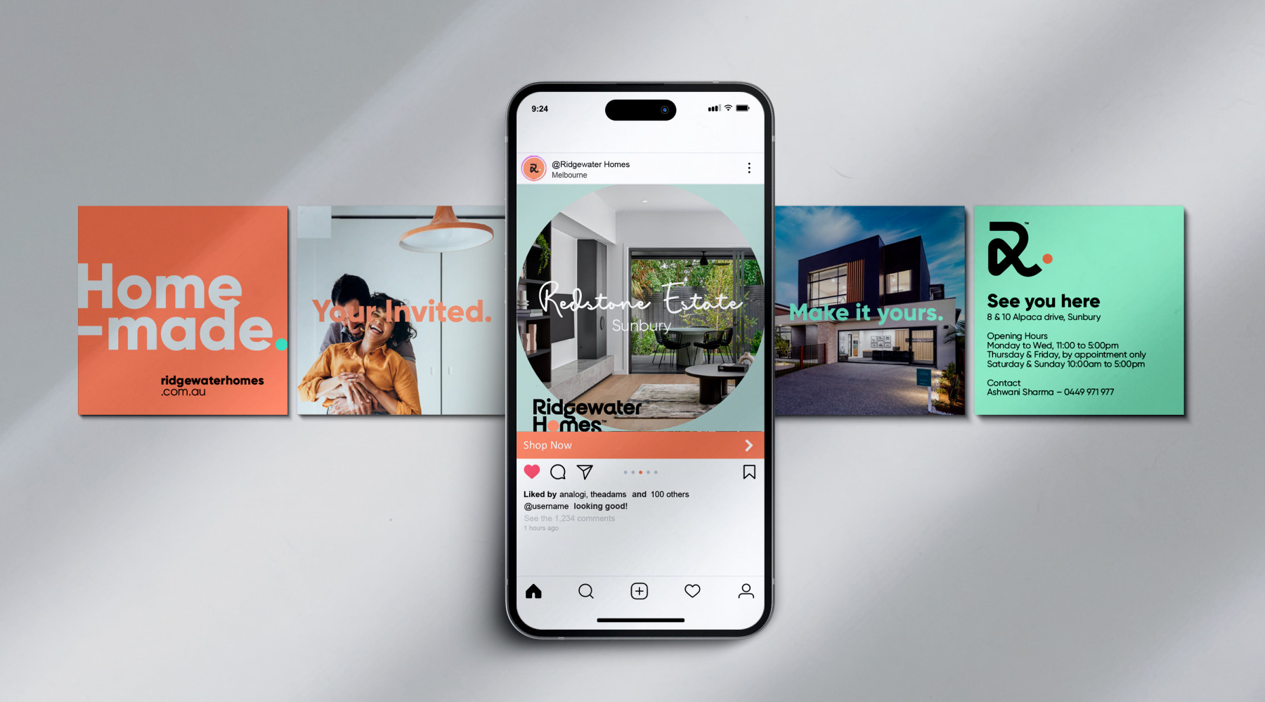
Our creative direction focused on bringing warmth and optimism to every element of the Ridgewater identity. We introduced a soft, bright colour palette to inject life, energy and approachability — shifting the brand from corporate to caring. These tones symbolise empathy and positivity, reflecting how Ridgewater listens to its clients and builds with heart.
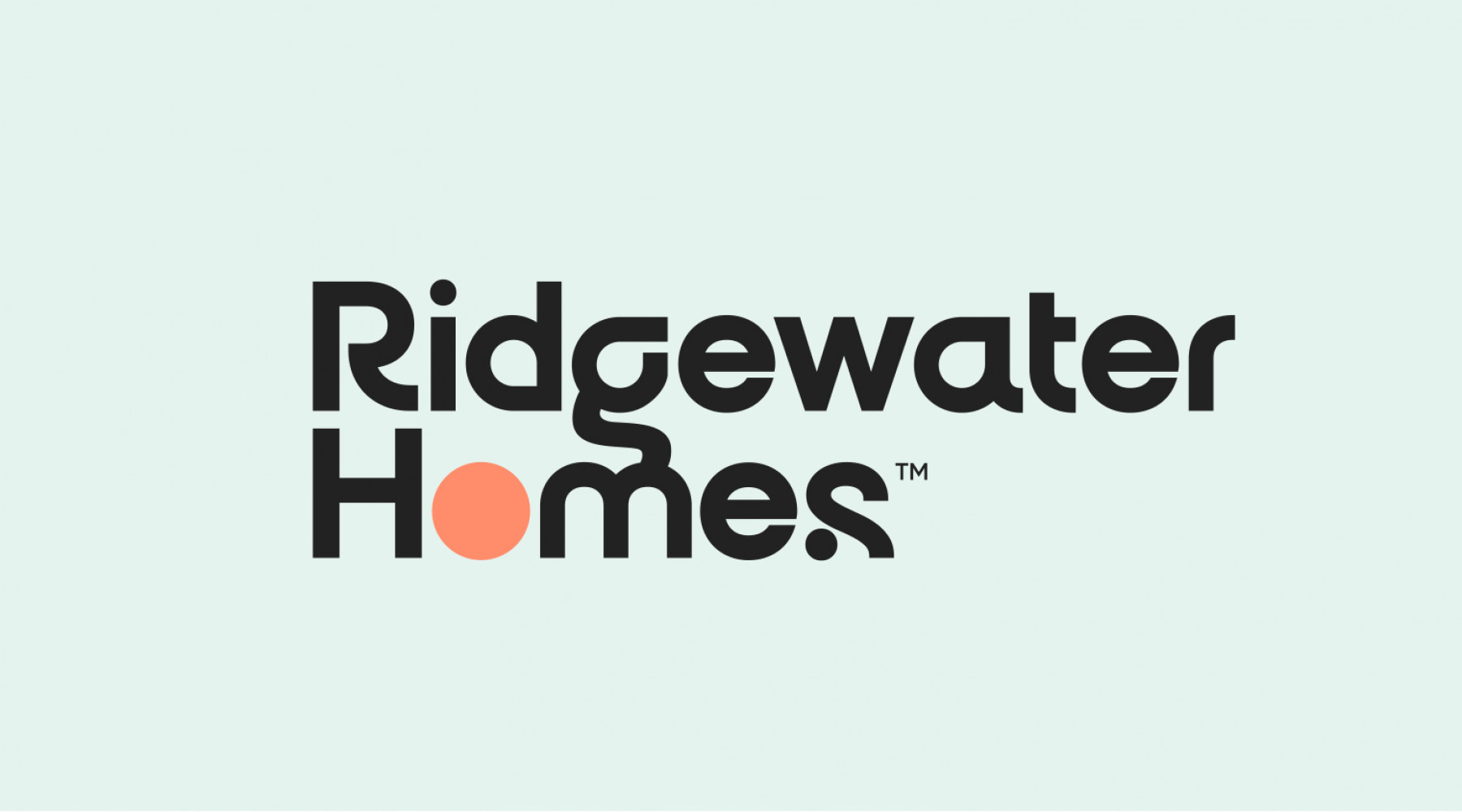
The reimagined logo became the storytelling centrepiece. The circular form animates upward, drawing out the ‘R’ before gently settling into the logotype — representing the customer journey from first dream to move-in day. As the red circle “clicks” into place, it symbolises the moment of arrival — the homeowner stepping into their new life, guided every step of the way by Ridgewater. The circle’s colour shifts across applications to reflect each customer’s individuality — reinforcing that no two homes, or people, are ever the same. Its smooth, continuous motion mirrors the brand promise: a journey that’s guided, enjoyable and full of anticipation.
To balance softness with confidence, the typography and headline system were designed to speak Informatively, Relatably and Aspirationally. The tone of voice is intelligent yet human — clear enough to inform, warm enough to connect, and aspirational enough to inspire. Headlines are bold, conversational and inclusive — written to invite people in, not talk down to them. Every line reinforces Ridgewater’s role as a trusted guide and creative collaborator in the homebuilding process.
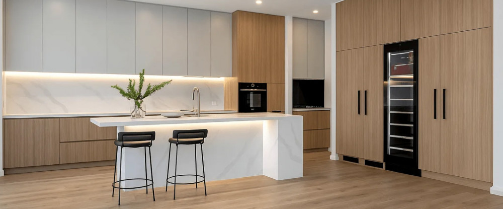
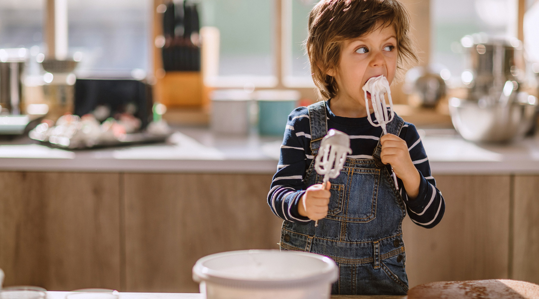
Imagery completes the story — bright, emotional and human. It celebrates real people, real homes and real joy — capturing those small, shining moments that define “home.” The art direction focuses on light, life and belonging, showing that Ridgewater doesn’t just build structures, it builds stories.
Together, these creative choices bring Ridgewater’s new essence to life:
Exceptional homes built uniquely around you to feel inspired.
And its heartfelt promise — that every home is, quite literally, Home-Made.

Explore more work